Shopify PagesProduct Page
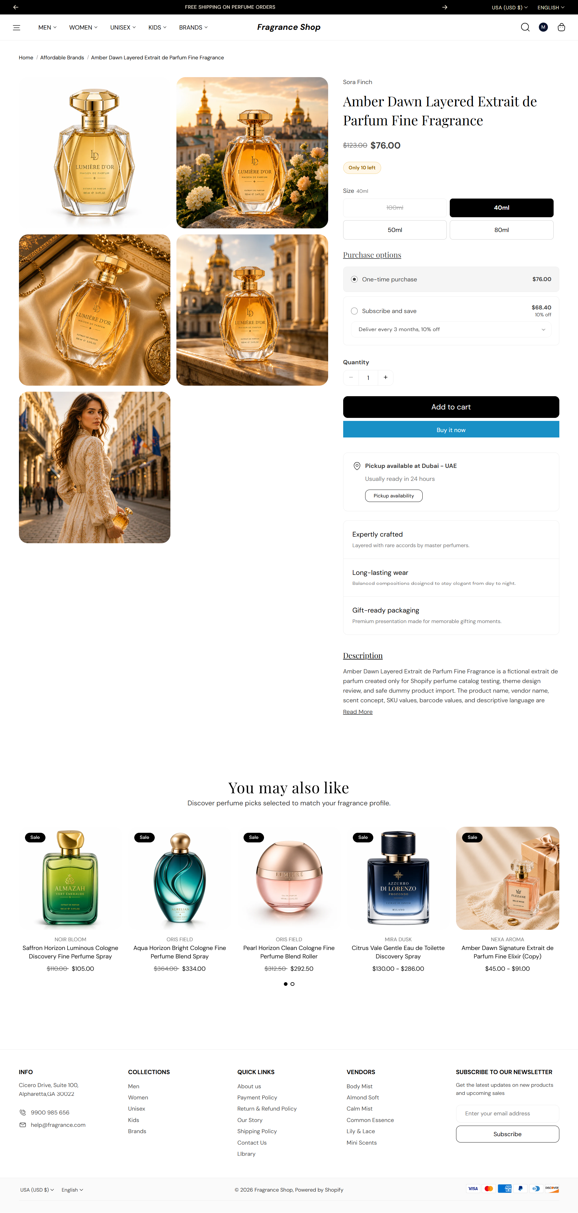
The Product page shows one item—gallery, price, variants, buy buttons, and blocks you arrange in the editor. You can also add product videos and recommended products below the main details.
Storefront preview
Storefront → Product page
How to open this page
Where to find this
Shopify Admin → Online Store → Themes → Customize
Open a product under Products and click View, then Customize—or choose Products → Default product from the page dropdown in Customize.
Theme editor → Product page → Template
Template sections
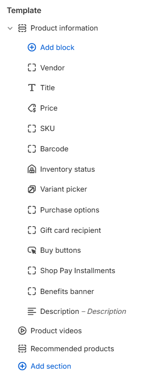
The default product template stacks three sections from top to bottom:
- Product information — media gallery and detail blocks (vendor, price, buy buttons, description, and more)
- Product videos — optional video list below the main details
- Recommended products — related or complementary product cards
Settings below follow that same order. Inside Product information, section options appear first, then each block in the order shown in the template sidebar.
Product information
Select Product information in the theme editor to style the gallery and arrange blocks. Reorder blocks with drag and drop, or add new ones with Add block.
Product information — Product media
Media layout
Sets how product images and videos are arranged beside the details column. Default: Two-column grid
Usage
- Choose a layout that fits your product photography—grid works well for multiple angles.
- Some layouts unlock extra options such as Make featured image large or slideshow arrows.
Make featured image large
For the two-column grid layout, makes the first media item full width. Default: Off
Usage
- Turn on to give the hero image more prominence in the grid.
- Turn off when every thumbnail should stay the same size.
Media width
Sets how much horizontal space the gallery takes on desktop. Default: Medium (60%)
Usage
- Use a wider gallery when product images are the main selling point.
- Use a narrower gallery to give more room to title, price, and buy buttons.
Image ratio
Sets the shape of each media frame. Default: 1:1 — Square · Auto shows the full image; fixed ratios may crop.
Usage
- Choose Auto when product photos have different proportions.
- Use a fixed ratio for a uniform grid—common for fragrance bottles and packaging shots.
Image fit
Sets how images fill the media frame. Default: Cover · Options: Cover, Contain
Usage
- Choose Cover to fill the frame—edges may crop.
- Choose Contain to show the full image—empty space may appear around it.
Image corner radius
Rounds the corners of product media. Uses the global border radius presets. Default: Extra large radius
Usage
Image background
Background color behind product images—helpful for PNGs with transparency. Default color: #FAFAFA
Usage
- Set a soft neutral when bottles or packaging have transparent backgrounds.
- Pair with Image blend mode for white-background JPG photos.
Image blend mode
Sets how images blend with the section background. Default: Normal · Options: Normal, Multiply
Usage
- Try Multiply with a light background color for white-background product photos.
- Keep Normal when images already include their own backdrop.
Enable zoom and lightbox
Lets customers zoom images and open a full-screen lightbox. Default: On
Usage
- Turn on for detail shots of packaging, notes, or texture.
- Turn off if you prefer a simpler, tap-only gallery.
Product information — Slideshow controls
Show navigation arrows
Shows previous and next arrows on the media slideshow. Default: On
Usage
- Turn on when products have several images or videos.
- Turn off for a minimal gallery without arrow controls.
Arrow color
Sets the color of slideshow arrows. Default color: #000000
Usage
- Pick a color with enough contrast against your product photos.
- Match arrow color to your header icons for consistency.
Product information — Vendor
Shows the product vendor from Shopify admin—often a brand or house name. Add the block with Add block → Vendor. There are no block settings; edit the vendor on each product under Products in Shopify admin.
Product information — Title
Shows the product title from Shopify admin. Add the block with Add block → Title. There are no block settings; edit the title on the product in Shopify admin.
Product information — Price
Show compare-at price
Shows the original price when a product is on sale. Default: On
Usage
- Turn on so sale items show both the sale price and the crossed-out compare-at price.
- Turn off for a single price line when you do not use compare-at pricing.
Show unit price
Shows unit pricing when it is set on the variant in Shopify admin. Default: On
Usage
- Turn on for products sold by volume or weight where unit price is required.
- Turn off when unit pricing does not apply to your catalog.
Show tax-inclusive note
Shows the tax note when your store is configured to display it. Default: Off
Usage
- Turn on when your market settings show prices including tax.
- Turn off to keep the price area compact.
Product information — SKU
Shows the SKU for the selected variant. Add the block with Add block → SKU. There are no block settings; SKUs are managed on each variant in Shopify admin.
Product information — Barcode
Shows the barcode (ISBN, UPC, GTIN, etc.) for the selected variant. Add the block with Add block → Barcode. There are no block settings; barcodes are managed on each variant in Shopify admin.
Product information — Inventory status
Low-stock threshold
Shows a low-stock message when inventory is at or below this number. Default: 10
Usage
- Lower the number for a stricter “almost gone” warning.
- Raise it when you want customers to see low stock earlier.
Product information — Variant picker
Picker style
Sets how customers choose variants. Default: Buttons · Options: Buttons, Dropdown
Usage
- Choose Buttons for size, concentration, or scent family options.
- Choose Dropdown when you have many variants and need a compact control.
Show color swatches
Displays swatch colors or images when picker style is Buttons. Configure swatches on each option value in the product admin. Default: Off
Usage
- Turn on for color or shade options with swatch images assigned in Shopify admin.
- Turn off when variants use text-only labels.
Product information — Purchase options
Show purchase options
Shows one-time and subscription choices when the product supports them. Default: On
Usage
- Turn on for subscription or selling-plan products.
- Turn off when the product is one-time purchase only.
Heading
Optional title above the purchase options. Leave blank to use the theme default from your store languages.
Usage
- Leave blank for the translated default label.
- Enter custom text when you want a brand-specific heading.
Show plan description
Shows the description for the selected subscription plan. Default: On
Usage
- Turn on when plan details help customers compare options.
- Turn off for a shorter purchase area.
Show subscription policy link
Shows a link to your subscription policy. Default: On
Usage
- Turn on when subscriptions require clear policy access.
- Turn off only if policy text is shown elsewhere on the page.
Subscription add to cart label
Button text when subscribe is selected. Default: Add subscription to cart
Usage
- Leave blank to use the theme default.
- Customize the label to match your brand voice—for example, Subscribe and save.
Product information — Gift card recipient
Collects recipient details when customers buy a gift card product. Add the block with Add block → Gift card recipient. It appears for gift card products—fields follow Shopify's gift card checkout requirements.
Product information — Buy buttons
Show quantity selector
Shows a quantity field beside the add to cart button. Default: On
Usage
- Turn on when customers often buy more than one unit.
- Turn off for a single-action add to cart when quantity is always one.
Show dynamic checkout button
Shows accelerated checkout buttons such as Shop Pay, Apple Pay, or PayPal. Default: On
Usage
- Turn on so each customer sees their preferred payment method.
- Turn off if you want only the standard add to cart button.
Product information — Shop Pay Installments
Show Shop Pay Installments banner
Shows the Shop Pay Installments message when installments are available for the product. Default: Off
Usage
- Turn on to highlight buy-now-pay-later options on eligible products.
- Turn off when you prefer not to show installments messaging on the product page.
Product information — Benefits banner
Icon
Small icon beside each benefit line. Recommended size: 30 px · upload 60 px for retina screens.
Usage
- Use simple line icons that read clearly at small sizes.
- Repeat icon, heading, and description fields for each item in the banner.
Heading
Short title for the benefit—for example, Expertly crafted.
Usage
- Keep headings to a few words.
- Connect a dynamic source when benefits vary by product metafield.
Description
Supporting line below the heading—for example, a note about perfumer craftsmanship or ingredients.
Usage
- Use one sentence per item.
- Format with bold or lists when a benefit needs extra detail.
Product information — Description
Heading
Title above the product description from Shopify admin. Default: Description
Usage
- Change the heading to match your tone—for example, About this fragrance.
- Leave blank to hide the heading and show body copy only.
Product information — Section spacing
Section spacing
Adds empty space above and below this section on desktop and mobile.
Usage
- Top padding (desktop) — Default: 40 px · 0–100 px
- Bottom padding (desktop) — Default: 40 px · 0–100 px
- Top padding (mobile) — Default: 40 px · 0–100 px
- Bottom padding (mobile) — Default: 40 px · 0–100 px
- When you move the slider, the gap above or below grows or shrinks
Product videos
Heading
Sets the section title above the video list. Default: Product videos
Usage
- Change the heading to match your brand voice—for example, See it in action.
- Connect a dynamic source if you store video section titles in metafields.
Open by default
Opens the video section when the page loads. Default: On
Usage
- Turn on when videos are a key part of the product story.
- Turn off to keep the section collapsed until the customer expands it.
Section spacing
Adds empty space above and below this section on desktop and mobile.
Usage
- Top padding (desktop) — Default: 40 px · 0–100 px
- Bottom padding (desktop) — Default: 40 px · 0–100 px
- Top padding (mobile) — Default: 40 px · 0–100 px
- Bottom padding (mobile) — Default: 40 px · 0–100 px
- When you move the slider, the gap above or below grows or shrinks
Recommended products
Shows a row or slideshow of related or complementary products below the main product details. Product card styling follows Theme settings → Product cards.
Recommended products — Recommendation source
Recommendation type
Chooses which product list Shopify shows. Default: Related products · Options: Related products, Complementary products
Usage
- Use Related products for similar items customers might also like.
- Use Complementary products for add-ons or pairings—configure both lists in the Search and Discovery app.
- To show both lists on one product page, add a second Recommended products section with the other intent.
Recommended products — Content
Heading
Sets the section title. Default: You may also like
Usage
- Leave blank to use the theme default heading.
- Match the heading to the recommendation type—for example, Pairs well with for complementary products.
Subheading
Optional text below the heading. Default: Discover perfume picks selected to match your fragrance profile.
Usage
- Leave blank to hide the subheading.
- Use a short line to explain why these products are shown.
Recommended products — Layout
Layout
Sets how recommendations are displayed. Default: Product list · Options: Product list, Product slideshow
Usage
- Choose Product list for a static grid of cards.
- Choose Product slideshow when you want a swipeable carousel—configure slideshow options in the panel below.
Products to show
Sets the maximum number of recommended products. Default: 10 · Range: 1–10
Usage
- Use fewer products for a tighter, curated row.
- Shopify only shows products that match the configured recommendation rules.
Recommended products — Product grid
Columns on desktop
Sets how many product cards appear per row on large screens. Default: 4 · Options: 2–5
Usage
- Applies to both list and slideshow layouts.
- Use fewer columns when product titles or badges need more room.
Columns on tablet
Sets how many product cards appear per row on tablet-sized screens. Default: 3 · Options: 2–4
Usage
- Match your collection page grid for a consistent browse experience.
Columns on mobile
Sets how many product cards appear per row on phones. Default: 2 · Options: 1–2
Usage
- Use 1 column for larger product images on small screens.
Recommended products — Slideshow
Autoplay
Automatically advances slides without customer interaction. Default: Off
Usage
- Turn on to cycle through recommendations on a timer.
- Pair with Autoplay speed to control how long each slide stays visible.
Autoplay speed
Sets seconds between slides when autoplay is on. Default: 6 s · Range: 2–10 s · Step: 2 s
Usage
- Use a slower speed when product cards have longer titles or badges.
Dot color
Sets the color of pagination dots. Default color: #000000
Usage
- Pick a color with enough contrast against the section background.
Recommended products — Section spacing
Section spacing
Adds empty space above and below this section on desktop and mobile.
Usage
- Top padding (desktop) — Default: 40 px · 0–100 px
- Bottom padding (desktop) — Default: 40 px · 0–100 px
- Top padding (mobile) — Default: 40 px · 0–100 px
- Bottom padding (mobile) — Default: 40 px · 0–100 px
- When you move the slider, the gap above or below grows or shrinks