Background
Background for the main footer area (menu columns, store information, and newsletter). Default color: #FFFFFF.
Usage
- Usually matches or complements your page background
Where it shows on the storefront
- Footer top section — all columns
The Footer appears at the bottom of your storefront. Use it to show store information, footer menus, newsletter signup, social icons, country and language selectors, and payment icons.
Themes → Customize → Footer
In the left sidebar, open the Footer group and select Footer.
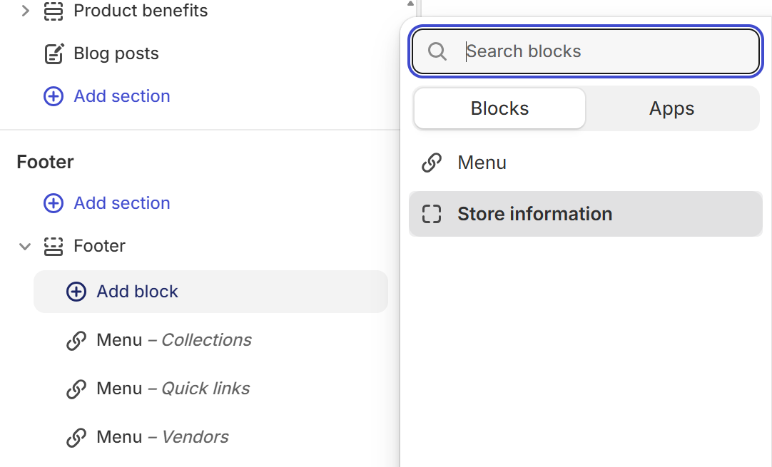
Add or reorder blocks (Menu, Store information) in the section list.
Add Menu blocks for link columns and one Store information block for address and contact. Social profile URLs come from Theme settings → Social media.
Select Footer in the left panel under the Footer group, or click it in the preview.
Top area with store information, menu columns, and newsletter; bottom bar with country/language selectors, copyright, and payment icons.
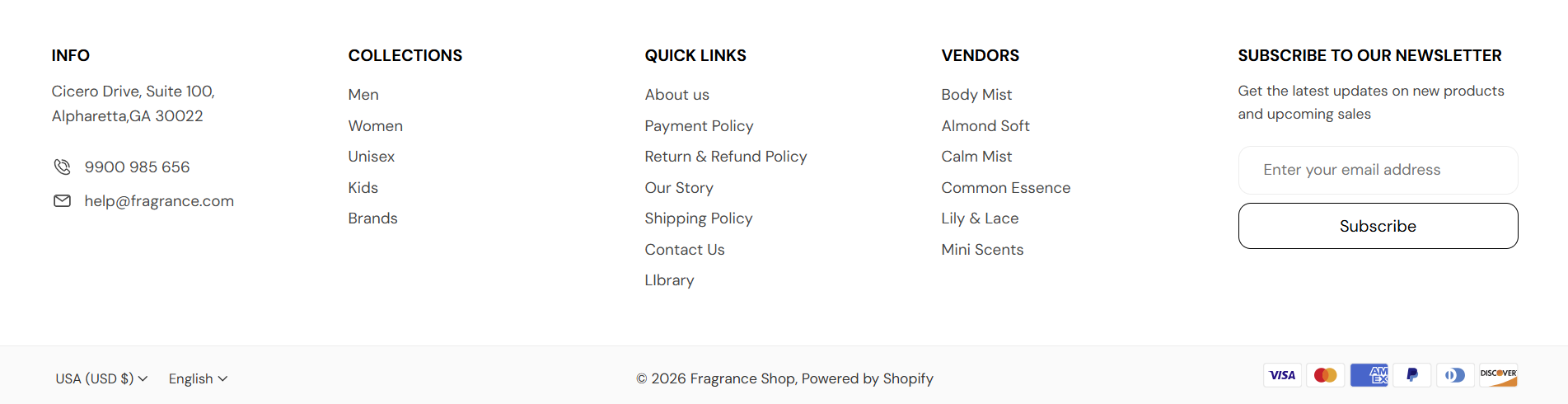
Storefront → Footer
Store information is your address, contact details, optional logo, and social icons in one column. You can add only one block per footer. In the editor, select Footer, click Add block, then choose Store information.

Storefront → Store information
Footer → Add block → Store information
Title for the store information column.
Usage
Where it shows on the storefront
Short text or address (rich text).
Usage
Where it shows on the storefront
Optional logo or brand mark above contact details.
Usage
Where it shows on the storefront
Describes the image for accessibility.
Usage
Where it shows on the storefront
Display width of the image in the footer. Default: 160 px · You can choose 50 to 300 px
Usage
Where it shows on the storefront
Phone number shown with a phone icon.
Usage
Where it shows on the storefront
Contact email shown with an envelope icon.
Usage
Where it shows on the storefront
Shows social icons when you want customers to visit your profiles from the footer. Default: Off
When turned on
When turned off
Add one Menu block per link column. Reorder blocks in the section list to change column order (for example, Collections, Quick links, Vendors). In the theme editor, select Footer, click Add block, then choose Menu.
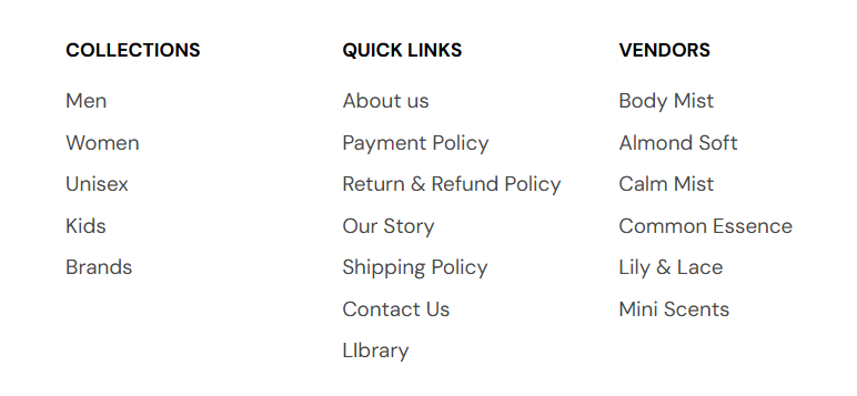
Storefront → Footer menus
Footer → Add block → Menu
Each Menu block is one column. The heading and menu fields are the same for every Menu block you add.
Title above this menu column.
Usage
Where it shows on the storefront
Navigation links for this column.
Usage
Where it shows on the storefront
The newsletter column is a section setting—not a block. It appears in the top footer row when enabled.
Storefront → Newsletter
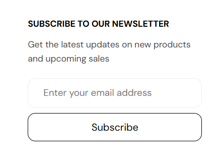
Email signup area in the footer top section. Default: On
When turned on
When turned off
Title above the signup form.
Usage
Where it shows on the storefront
Short line under the heading.
Usage
Where it shows on the storefront
Country/region and language selectors in the footer bottom bar. Under Footer localization in the section settings. The bottom strip also shows Follow on Shop when enabled under Theme settings → Follow on Shop.
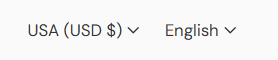
Storefront → Localization
Market or currency selector in the footer bottom. Default: On
When turned on
When turned off
Language selector in the footer bottom. Default: On
When turned on
When turned off
Payment icons help customers recognize supported payment methods before checkout. Keep this enabled when you accept multiple card or wallet types.
Storefront → Payment icons
Shows payment method icons Shopify detects from your store’s enabled payment types. Default: On
When turned on
When turned off
Where it shows on the storefront