Theme Sections

Call to action cards

Call to action cards shows a centered heading and subheading above a row of linked pill buttons. Add up to sixteen buttons for scent families, collections, or quick links, and choose one button style preset for every pill in the row.
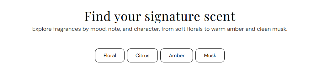
Storefront preview

Call to action cards section preview on the Fragrance Shop storefront

Storefront preview

Where to find this section

Call to action cards section and Button blocks in the Fragrance Shop theme editor

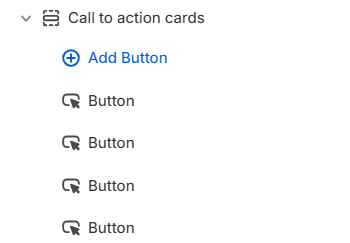
Theme editor → Call to action cards → Button blocks

Content

Heading

Main title above the pill buttons (for example Why teams choose us). Leave blank to hide the heading.

Usage

  • Use a short headline that introduces the button row.
  • Keep to one line for a clean centered layout.

Subheading

Supporting line under the heading. Line breaks in the editor are preserved on the storefront. Leave blank to show the heading only.

Usage

  • Add one or two sentences that explain what the buttons link to.
  • Leave blank for a heading-only section.

Button style

Button style

Sets the visual style for every pill button in this section using your theme’s button presets. Options include Primary, Secondary, and Tertiary. Default: Secondary.

Usage

  • Choose a preset that matches how prominent you want the button row to feel on the page.
  • Applies to all Button blocks so every pill in the row looks consistent.
  • Global button colors and typography come from Theme settings → Buttons.

Button block

Button label

Text on the pill (for example Floral, Citrus, or Amber).

Usage

  • Keep labels short so multiple pills fit on one row.
  • Each Button block adds one pill to the grid.

Open in new tab

Opens the button link in a new browser tab when enabled. Default: Off.

Usage

  • Use for external URLs; keep off for in-store collection and product links.

Section spacing

Section spacing

Adds empty space above and below this section on desktop and mobile.

Usage

  • Top padding (desktop) — Default: 40 px · 0–100 px
  • Bottom padding (desktop) — Default: 40 px · 0–100 px
  • Top padding (mobile) — Default: 40 px · 0–100 px
  • Bottom padding (mobile) — Default: 40 px · 0–100 px
  • When you move the slider, the gap above or below grows or shrinks