Background style
Chooses whether the stripe uses a single color or a gradient. Options: Solid or Gradient. Default: Gradient.
Usage
- Use Gradient for a vibrant marquee like the storefront preview.
- Use Solid for a flat brand color bar.
Scrolling text is a full-width marquee of icon-and-label pairs that loop horizontally. Add up to 15 text items, pick a solid or gradient background, and set text color for offers, brand phrases, or collection tags.
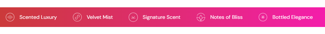
Storefront preview
Themes → Customize → Add section → Scrolling text
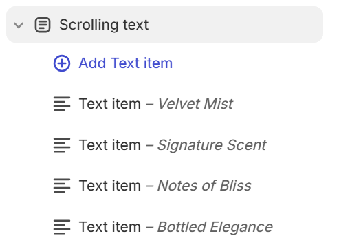
Find it under Marketing and offers in the section picker. After adding the section, use Add Text item for each line in the marquee (up to 15).
Theme editor section list
Chooses whether the stripe uses a single color or a gradient. Options: Solid or Gradient. Default: Gradient.
Usage
Fill color when Background style is Solid. Default color: #CB3A3A.
Usage
Gradient fill when Background style is Gradient. Choose a gradient preset in the picker. Default: linear gradient from #CB3A3A to #F61CB1.
Usage
Color for each text item label in the marquee. Default color: #FFFFFF.
Usage
Each block is one icon-and-label pair in the scrolling strip. You can add up to 15 text items and reorder them in the section sidebar.
Usage
Small image shown before the label (for example a line icon in a circle). Recommended size: 40 px; use 80 px for retina.
Usage
Describes the icon when it adds meaning for accessibility.
Usage
Label shown beside the icon (for example Velvet Mist). Default on new blocks: Velvet mist.
Usage
Adds empty space above and below this section on desktop and mobile.
Usage