Theme Sections

Reviews and logos

Reviews and logos pairs a headline and partner logo row with a compact rating card. Use it to show press logos, certification marks, or retail partners alongside a star rating and link to your full reviews page.

Storefront preview

Reviews and logos section preview on the Fragrance Shop storefront

Storefront preview

Where to find this section

Reviews and logos section and Logo blocks in the Fragrance Shop theme editor

Theme editor section list

Content

Heading

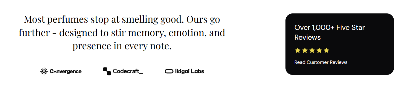
Main title shown above the logo row (for example a short brand statement about quality or trust).

Usage

  • Keep it concise so logos and the rating card stay visually balanced.
  • Leave blank to hide the heading and show only logos and the rating card.

Heading color

Color for the section heading. Default color: #000000.

Usage

  • Match your page heading colors for a consistent editorial look.
  • Ensure strong contrast against the section background.

Heading size

Adjusts the font size of the section heading. Range: 20–40 px, step 2. Default: 32 px.

Usage

  • When you move the slider, the heading grows or shrinks on the storefront.
  • Use a larger size when this section is the main trust message on the page.

Review card

Card background

Background color for the rating card beside the logos. Default color: #FAFAFA.

Usage

  • Use a soft neutral so the card stands out from the page background.
  • Pair with the text and star colors for readable contrast.

Card corner radius

Rounds the corners of the rating card using presets from Theme settings → Border radius. Default: Extra large radius.

Usage

  • Pick a preset that matches rounded corners used elsewhere on your store.
  • Applies only to the rating card, not the logo images.

Text color

Color for the review heading and link text inside the card. Default color: #000000.

Usage

  • Ensure the text remains readable against the card background you choose.
  • Applies to the review heading and the link below the stars.

Star color

Fill color for active stars in the rating display. Default color: #F7D034.

Usage

  • Use a warm gold tone for a familiar review-star look.
  • Inactive stars remain unfilled regardless of this color.

Review heading

Short label above the stars (for example Excellent rating). Default: Excellent rating.

Usage

  • Summarize your overall score in a few words customers understand quickly.
  • Leave blank to hide the heading and show only stars and the link.

Star rating

Sets how many stars appear filled in the card. Range: 3–5. Default: 4.

Usage

  • Match this to your actual average review score for accuracy.
  • When you move the slider, the number of filled stars updates on the storefront.

Logo block

Image

Uploads the partner, press, or certification logo for this block.

Usage

  • Add one Logo block per logo with Add Logo (up to three blocks).
  • Best width: about 180 px. For sharp retina screens, upload a image at 360 px.
  • Use transparent PNG or SVG logos on a clean background for the best result.

Alt text

Describes the logo for screen readers and search engines. If left blank, the section heading is used as a fallback.

Usage

  • Name the publication, retailer, or certification (for example Vogue or Cruelty Free Certified).
  • Do not repeat the section heading—describe each logo specifically.

Section spacing

Section spacing

Adds empty space above and below this section on desktop and mobile.

Usage

  • Top padding (desktop) — Default: 40 px · 0–100 px
  • Bottom padding (desktop) — Default: 40 px · 0–100 px
  • Top padding (mobile) — Default: 40 px · 0–100 px
  • Bottom padding (mobile) — Default: 40 px · 0–100 px
  • When you move the slider, the gap above or below grows or shrinks