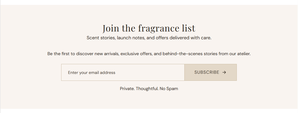
Theme Sections

Newsletter

Newsletter is a centered email signup block with heading, subheading, rich body text, and a subscribe button. Submissions are added to your Shopify customer list with the newsletter tag.

Storefront preview

Newsletter section preview on the Fragrance Shop storefront

Storefront preview

Where to find this section

Newsletter in the Add section list under Forms

Theme editor section picker

Content

Heading

Main title above the signup form (for example Join the fragrance list).

Usage

  • Keep it short and action-oriented for list growth.
  • Leave blank to hide the heading line while keeping the subheading or body text.

Subheading

Secondary line shown under the heading in smaller type (for example Scent stories, launch notes, and offers delivered with care.). 60 characters max.

Usage

  • Stay within the character limit so the line does not wrap awkwardly on mobile.
  • Leave blank to show the heading without a subheading.

Body text

Rich text below the headings. Use basic HTML to format text, add links, and line breaks. Default copy includes a link to your privacy policy page.

Usage

  • Add a privacy policy link so subscribers know how their email is used.
  • Use the editor toolbar for bold, italic, lists, and links where needed.
  • Leave blank to show headings and the form only.

Button label

Text on the submit button (for example Subscribe). Default: Subscribe.

Usage

  • Match your brand voice (Subscribe, Join, Sign up).
  • If left blank, the theme falls back to the default translated label.

Colors

Background

Background color for the entire newsletter section, behind the heading, text, and signup form. Default color: #FAFAFA.

Usage

  • Use a soft neutral to separate the signup block from surrounding sections.
  • Match footer or page background tones for a cohesive look.

Text color

Color for the heading, subheading, and body text above the form. Default color: #000000.

Usage

  • Ensure strong contrast against the section background you choose.
  • Body links inherit styling from the rich text editor and theme CSS.

Form appearance

Input background

Background color for the email address field. Default color: #F9F4F0.

Usage

  • Choose a light tone that stands out from the section background.
  • Preview on mobile—the field spans the full width on smaller screens.

Input text

Color for the email placeholder and typed text inside the field. Default color: #383026.

Usage

  • Pick a dark shade with clear contrast against the input background.
  • Check readability for both the placeholder and entered email address.

Button background

Background color for the subscribe button beside the email field. Default color: #E3D8C8.

Usage

  • Use a tone that complements the input field without blending into it.
  • Match accent colors used on other primary actions across your store.

Button text

Color for the subscribe button label. Default color: #383026.

Usage

  • Ensure the label stays easy to read against the button background.
  • Keep contrast strong enough for accessibility on smaller mobile screens.

Form border

Border color around the email field and subscribe button row. Default color: #C5B499.

Usage

  • Use a subtle border to define the form against the section background.
  • Adjust if the border feels too strong or too faint on your chosen colors.

Section spacing

Section spacing

Adds empty space above and below this section on desktop and mobile.

Usage

  • Top padding (desktop) — Default: 40 px · 0–100 px
  • Bottom padding (desktop) — Default: 40 px · 0–100 px
  • Top padding (mobile) — Default: 40 px · 0–100 px
  • Bottom padding (mobile) — Default: 40 px · 0–100 px
  • When you move the slider, the gap above or below grows or shrinks