Image position
Which side the image appears on in the two-column layout. Options: Left or Right. Default: Left.
Usage
- Use Left for the layout shown in the storefront preview.
- Use Right to alternate with other image-with-text sections on the page.
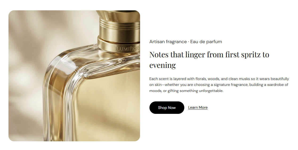
Image with text is a two-column section with a photo on one side and subheading, heading, description, and up to two optional buttons on the other. Choose image position, ratio, and corner radius, or expand the section to full width.
Storefront preview
Themes → Customize → Add section → Image with text
Find it under Images and media in the section picker.
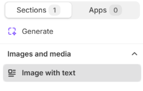
Section picker
Which side the image appears on in the two-column layout. Options: Left or Right. Default: Left.
Usage
Expands the section content to the full page width when turned on. When off, the section stays within the page container. Default: Off.
Usage
Photo for the media column. Recommended size: 750 px wide; use 1500 px for retina quality.
Usage
Describes the image for accessibility and SEO. Falls back to the image file alt text or heading when left blank.
Usage
Sets the crop shape of the section image. Default: 1:1 – Square.
Usage
Rounds the image corners using presets from Theme settings → Border radius. Default: Extra large radius.
Usage
Small label above the main heading (for example Artisan fragrance · Eau de parfum). Recommended: up to 60 characters. Leave blank to hide the subheading.
Usage
Main title beside the image (for example Notes that linger from first spritz to evening). Leave blank to hide the heading.
Usage
HTML heading level used for the title. Options: H1 through H6. Default: H2.
Usage
Rich-text body copy under the heading. Supports bold, italic, links, and lists.
Usage
Adds empty space above and below this section on desktop and mobile.
Usage