Heading
Sets the main title shown above the banner row.
Usage
- Keep it short and descriptive so customers understand the group at a glance.
- Leave blank to hide the heading and show only the banner grid.
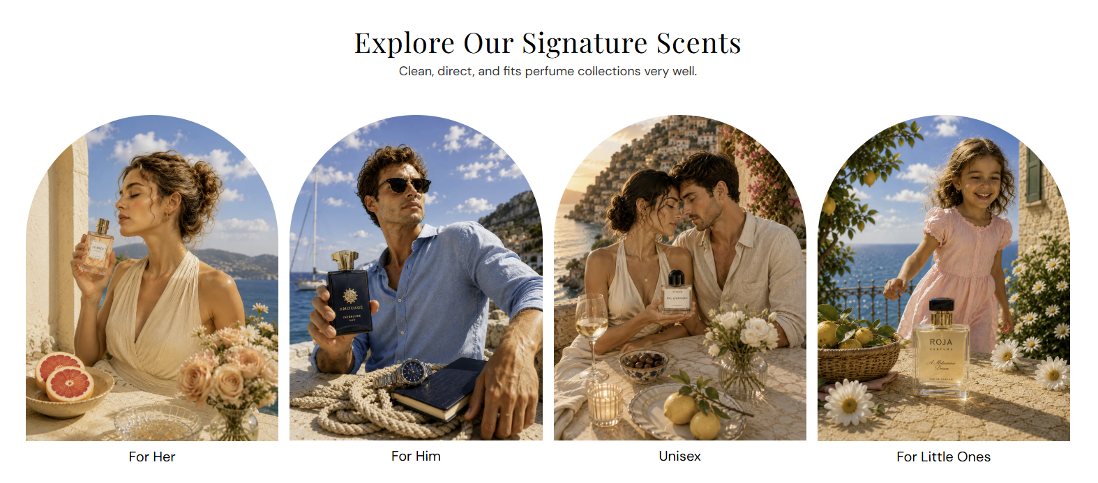
Image banner grid displays a centered heading and up to four linked image banners in a row. Use it to showcase collections, audience segments, or fragrance families with a clean editorial layout.

Storefront preview
Themes → Customize → Add section → Image banner grid
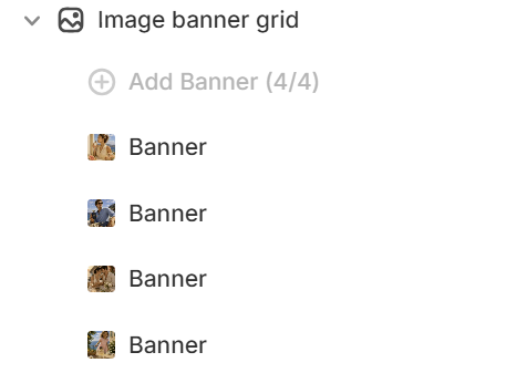
After adding the section, set the heading in section settings and add up to 4 Banner blocks.

Theme editor section list
Sets the main title shown above the banner row.
Usage
Adds supporting text below the heading.
Usage
Sets the corner style for all banner images in this section. Options: Corner or Half rounded. Default: Half rounded.
Usage
Sets the aspect ratio for all banner images. Auto shows the full image; fixed ratios may crop to fit.
Usage
Uploads the image for each banner tile. Recommended size: 370 px wide; use 740 px for retina quality.
Usage
Describes the image for accessibility and SEO.
Usage
Sets the label shown below each banner image (for example, For Her or Bestsellers).
Usage
Makes each banner clickable to a collection, product, or page.
Usage
Opens the banner link in a new tab when enabled. Default: Off.
Usage
Adds empty space above and below this section on desktop and mobile.
Usage