Autoplay
Advances to the next slide automatically when enabled. Default: On.
Usage
- Turn on for a rotating hero that cycles through slides without shopper input.
- Turn off when you want shoppers to move through slides only with arrows or dots.
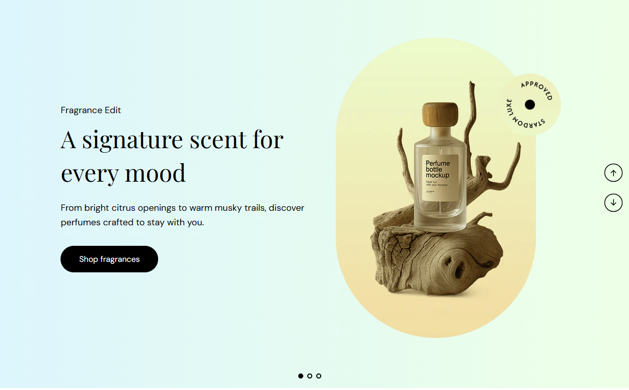
Hero slideshow is a full-width carousel with copy on one side and product imagery on the other. Add up to ten slides, each with its own tagline, heading, description, button, images, and background. Autoplay, arrows, and dots are controlled at the section level.
Storefront preview
Themes → Customize → Add section → Hero slideshow
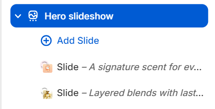
Find it under Slideshows in the section picker. After adding the section, use Add Slide for each carousel panel (up to 10).
Theme editor section list
Advances to the next slide automatically when enabled. Default: On.
Usage
How long each slide stays visible before autoplay moves to the next one. Range: 2–10 s (step 1). Default: 5 s. Applies when Autoplay is on.
Usage
Shows previous and next arrow controls on the carousel. Arrows appear only when the section has more than one slide. Default: On.
Usage
Shows dot indicators for each slide at the bottom of the carousel. Dots appear only when the section has more than one slide. Default: On.
Usage
Color of the previous and next arrow icons. Default color: #000000.
Usage
Color of the pagination dots. Default color: #000000.
Usage
Small label above the main heading (for example Fragrance Edit). Leave blank to hide the tagline on this slide.
Usage
Color of the tagline text. Default color: #000000.
Usage
Size of the tagline text. Range: 18–24 px (step 1). Default: 18 px.
Usage
Main heading for the slide (for example A signature scent for every mood). Leave blank to hide the heading on this slide.
Usage
Color of the heading text. Default color: #000000.
Usage
Size of the heading text. Range: 40–60 px (step 2). Default: 48 px.
Usage
Supporting paragraph under the heading. Leave blank to show tagline and heading only.
Usage
Color of the description text. Default color: #000000.
Usage
Size of the description text. Range: 18–24 px (step 1). Default: 18 px.
Usage
Text on the call-to-action button (for example Shop fragrances). Leave blank to hide the button on this slide.
Usage
Destination when the button is clicked—a collection, product, or page in your store.
Usage
Opens the button link in a new browser tab when enabled. Default: Off.
Usage
Visual style of the button. Options: Primary, Secondary, Tertiary, or Arrow button. Default: Tertiary.
Usage
Primary product or lifestyle image on the right side of the slide. Recommended size: 400 px wide; use 800 px for retina quality.
Usage
Describes the main image for accessibility and SEO. Falls back to the image file alt text or slide heading when left blank.
Usage
Smaller accent image layered near the main image (for example a secondary bottle or detail shot). Recommended size: 130 px; use 260 px for retina quality.
Usage
Describes the decorative image for screen readers. Falls back to the image file alt text or slide heading when left blank.
Usage
How the slide background is filled. Options: Solid, Gradient, or Image. Default: Gradient.
Usage
Fill color when Background style is Solid. Default color: #FFFBF4.
Usage
Gradient fill when Background style is Gradient. Uses the theme gradient picker. Default: warm pink-to-cream gradient.
Usage
Full-slide background photo when Background style is Image. Recommended size: 2000 px wide; use 4000 px for retina quality.
Usage
Adds empty space above and below this section on desktop and mobile.
Usage