Shopify PagesProduct Page
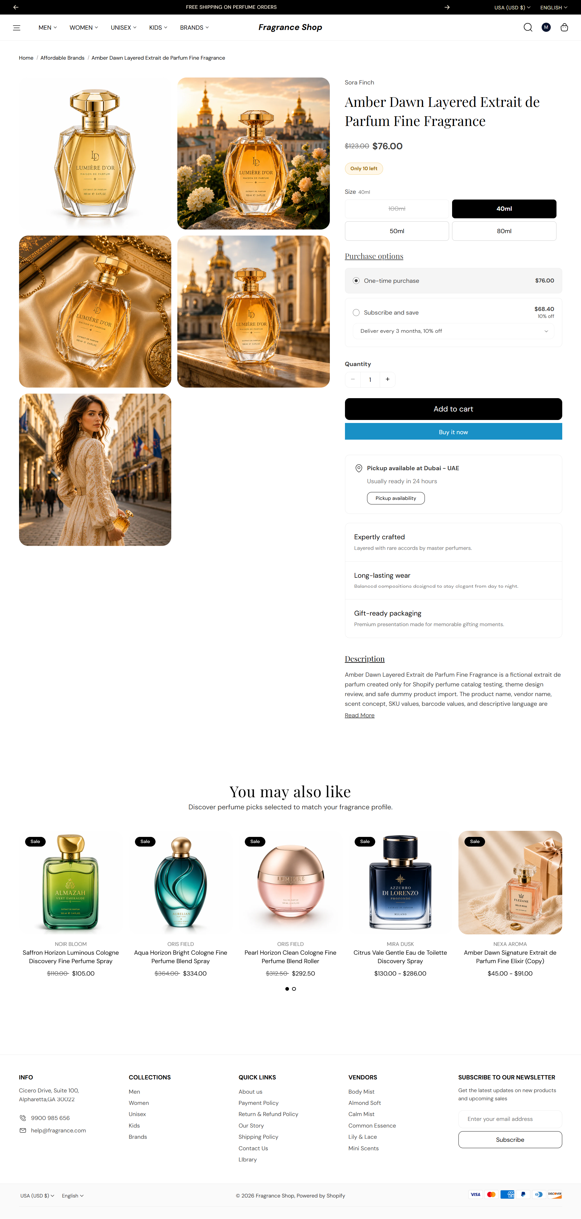
The Product page shows one item—gallery, price, variants, buy buttons, and blocks you arrange in the editor. You can also add product videos and recommended products below the main details.
Storefront preview
Storefront → Product page
How to open this page
Where to find this
Shopify Admin → Online Store → Themes → Customize
Open a product under Products and click View, then Customize—or choose Products → Default product from the page dropdown in Customize.
Theme editor → Product page → Template
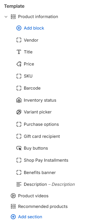
Product information
The main Product information section holds your media gallery and all product detail blocks—vendor, title, price, variant picker, buy buttons, description, and more. Reorder blocks with drag and drop, or add new ones with Add block.
- Section settings cover the media slideshow, checkout messaging, and section spacing.
- Each block has its own settings—for example, Price, Variant picker, and Buy buttons.
- Product card styling in recommendations follows Theme settings → Product cards.
Open Product information in the theme editor to adjust section settings and each block listed in the overview above.
Product videos
Heading
Sets the section title above the video list. Default: Product videos
Usage
- Change the heading to match your brand voice—for example, See it in action.
- Connect a dynamic source if you store video section titles in metafields.
Open by default
Opens the video section when the page loads. Default: On
Usage
- Turn on when videos are a key part of the product story.
- Turn off to keep the section collapsed until the customer expands it.
Section spacing
Adds empty space above and below this section on desktop and mobile.
Usage
- Top padding (desktop) — Default: 40 px · 0–100 px
- Bottom padding (desktop) — Default: 40 px · 0–100 px
- Top padding (mobile) — Default: 40 px · 0–100 px
- Bottom padding (mobile) — Default: 40 px · 0–100 px
- When you move the slider, the gap above or below grows or shrinks
Recommended products — Recommendation source
Recommendation type
Chooses which product list Shopify shows. Default: Related products · Options: Related products, Complementary products
Usage
- Use Related products for similar items customers might also like.
- Use Complementary products for add-ons or pairings—configure both lists in the Search and Discovery app.
- To show both lists on one product page, add a second Recommended products section with the other intent.
Recommended products — Content
Heading
Sets the section title. Default: You may also like
Usage
- Leave blank to use the theme default heading.
- Match the heading to the recommendation type—for example, Pairs well with for complementary products.
Subheading
Optional text below the heading. Default: Discover perfume picks selected to match your fragrance profile.
Usage
- Leave blank to hide the subheading.
- Use a short line to explain why these products are shown.
Recommended products — Layout
Layout
Sets how recommendations are displayed. Default: Product list · Options: Product list, Product slideshow
Usage
- Choose Product list for a static grid of cards.
- Choose Product slideshow when you want a swipeable carousel—configure slideshow options in the panel below.
Products to show
Sets the maximum number of recommended products. Default: 10 · Range: 1–10
Usage
- Use fewer products for a tighter, curated row.
- Shopify only shows products that match the configured recommendation rules.
Recommended products — Product grid
Columns on desktop
Sets how many product cards appear per row on large screens. Default: 4 · Options: 2–5
Usage
- Applies to both list and slideshow layouts.
- Use fewer columns when product titles or badges need more room.
Columns on tablet
Sets how many product cards appear per row on tablet-sized screens. Default: 3 · Options: 2–4
Usage
- Match your collection page grid for a consistent browse experience.
Columns on mobile
Sets how many product cards appear per row on phones. Default: 2 · Options: 1–2
Usage
- Use 1 column for larger product images on small screens.
Recommended products — Slideshow
Autoplay
Automatically advances slides without customer interaction. Default: Off
Usage
- Turn on to cycle through recommendations on a timer.
- Pair with Autoplay speed to control how long each slide stays visible.
Autoplay speed
Sets seconds between slides when autoplay is on. Default: 6 s · Range: 2–10 s · Step: 2 s
Usage
- Use a slower speed when product cards have longer titles or badges.
Dot color
Sets the color of pagination dots. Default color: #000000
Usage
- Pick a color with enough contrast against the section background.
Section spacing
Section spacing
Adds empty space above and below this section on desktop and mobile.
Usage
- Top padding (desktop) — Default: 40 px · 0–100 px
- Bottom padding (desktop) — Default: 40 px · 0–100 px
- Top padding (mobile) — Default: 40 px · 0–100 px
- Bottom padding (mobile) — Default: 40 px · 0–100 px
- When you move the slider, the gap above or below grows or shrinks