Heading
Sets the main title shown above the collection grid.
Usage
- Keep it short so customers understand what the row represents.
- Leave blank to hide the heading and show only collection cards.
Collection list displays a heading and a grid of collection cards you add as blocks. Use it to highlight signature collections, scent families, or curated groups with optional custom labels under each image.
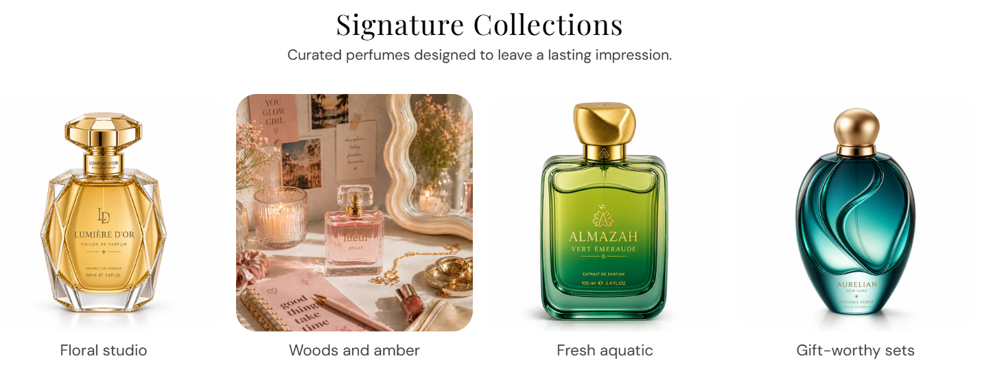
Storefront preview
Themes → Customize → Add section → Collection list
After adding the section, use Add Collection to add one block per collection card.
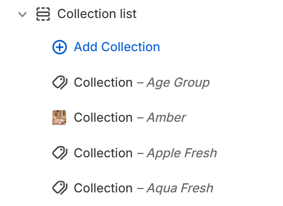
Theme editor section list
Sets the main title shown above the collection grid.
Usage
Adds supporting text below the heading.
Usage
Sets how many collection cards appear per row on desktop. Range: 2–5. Default: 4.
Usage
Sets how many collection cards appear per row on mobile. Range: 1–3. Default: 1.
Usage
Sets the aspect ratio for each collection image. Default: 1:1 – Square.
Usage
Sets the background color behind each collection image (visible when the image does not fill the frame). Default color: #FAFAFA.
Usage
Rounds the corners of collection images using presets from Theme settings → Border radius. Default: Extra large radius.
Usage
Sets how each collection image fills its tile. Default: Cover.
Usage
Sets how the image blends with the card background. Default: Normal.
Usage
Adds space around each collection image inside the card. Default: 0 px. Range: 0–16 px.
Usage
Selects which collection this card links to. The collection’s featured image is used on the card.
Usage
Optional label shown under the image instead of the collection name.
Usage
Adds empty space above and below this section on desktop and mobile.
Usage