Heading
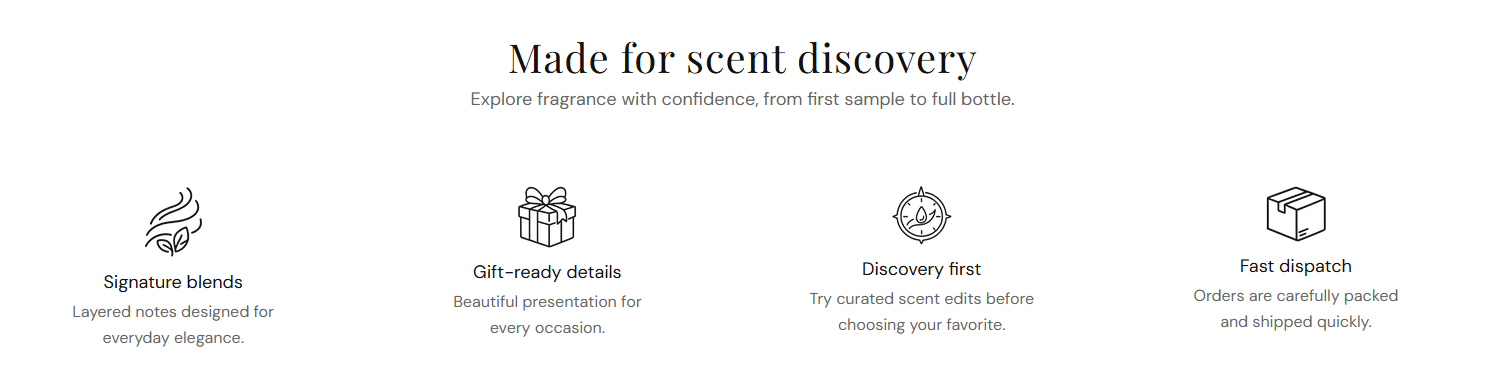
Main title shown above the benefit row. Default: Made for scent discovery.
Usage
- Keep it short so customers quickly understand what the row represents.
- Leave blank to hide the heading and show only benefit items.
Benefits bar is a compact row of icon-led selling points with a section heading and subheading. Add up to four Benefit item blocks to highlight shipping, gifting, discovery, or quality promises in a clean horizontal layout.
Storefront preview
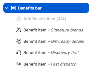
Themes → Customize → Add section → Benefits bar
Find it under the Trust and reviews group in the section picker. After adding the section, use Add Benefit item to add one block per benefit (maximum 4).
Theme editor section list
Main title shown above the benefit row. Default: Made for scent discovery.
Usage
Supporting line below the heading. Default: Explore fragrance with confidence, from first sample to full bottle.
Usage
Color for the section heading and each benefit item title. Default color: #111111.
Usage
Color for the section subheading and each benefit item description. Default color: #666666.
Usage
Small image shown above each benefit title. Recommended size: 40 px; upload 80 px for sharp display on retina screens.
Usage
Describes the icon for screen readers when the image adds meaning beyond decoration.
Usage
Title for this benefit (for example Signature blends). Shown below the icon.
Usage
Short supporting line under the benefit heading (for example Layered notes designed for everyday elegance.).
Usage
Adds empty space above and below this section on desktop and mobile.
Usage