Autoplay
Advances to the next slide automatically when enabled. Default: On.
Usage
- Turn on for a rotating hero that cycles through slides without shopper input.
- Turn off when you want shoppers to move through slides only with arrows or dots.
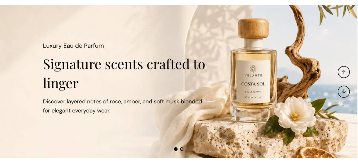
Image slideshow is a full-width carousel where each slide uses a background image or video with overlaid heading, subheading, and description. Add up to ten slides, set autoplay and navigation, and darken the media with a color overlay so text stays readable.
Storefront preview
Themes → Customize → Add section → Image slideshow
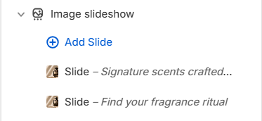
Find it under Slideshows in the section picker. After adding the section, use Add Slide for each panel (up to 10).
Theme editor section list
Advances to the next slide automatically when enabled. Default: On.
Usage
How long each slide stays visible before autoplay moves to the next one. Range: 2–10 s (step 1). Default: 5 s. Applies when Autoplay is on.
Usage
Shows previous and next arrow controls on the carousel. Arrows appear only when the section has more than one slide. Default: On.
Usage
Shows dot indicators for each slide at the bottom of the carousel. Dots appear only when the section has more than one slide. Default: On.
Usage
Returns to the first slide after the last one when enabled. Default: On.
Usage
Color of the previous and next arrow icons. Default color: #000000.
Usage
Color of the pagination dots. Default color: #000000.
Usage
Horizontal position of the overlaid text on each slide. Options: Left, Center, or Right. Default: Left.
Usage
Sets the crop shape of slide media across the carousel. Default: Auto – Original.
Usage
Tint placed over each slide’s image or video to improve text contrast. Default color: #000000.
Usage
Strength of the overlay tint. Range: 0–90% (step 5). Default: 50%.
Usage
Background image for this slide. Recommended size: 2000 px wide; use 4000 px for retina quality.
Usage
Describes the slide image for accessibility and SEO. Falls back to the slide heading or store name when left blank.
Usage
Shopify-hosted video that plays as the slide background instead of a still image.
Usage
YouTube or Vimeo link used as the slide background when no hosted video is selected.
Usage
Color applied to the subheading, heading, and description on this slide. Default color: #FFFFFF.
Usage
Main title overlaid on the slide (for example Signature scents crafted to linger). Leave blank to hide the heading on this slide.
Usage
Size of the heading text. Range: 40–60 px (step 2). Default: 40 px.
Usage
Small label above the heading (for example Luxury Eau de Parfum). Leave blank to hide the subheading on this slide.
Usage
Size of the subheading text. Range: 18–24 px (step 1). Default: 18 px.
Usage
Supporting paragraph under the heading. Leave blank to show subheading and heading only.
Usage
Size of the description text. Range: 18–24 px (step 2). Default: 18 px.
Usage
Makes the entire slide clickable and links to a collection, product, or page in your store.
Usage
Accessible label for the invisible slide link, read by screen readers. Falls back to the slide heading when left blank.
Usage
Opens the slide link in a new browser tab when enabled. Default: Off.
Usage
Adds empty space above and below this section on desktop and mobile.
Usage