Theme Sections

Testimonials

Testimonials combines a summary card with headline stats and a slideshow of customer reviews. Add review blocks with photos, star ratings, and quotes to build social proof for your fragrance brand on any page template.

Storefront preview

Testimonials section preview on the Fragrance Shop storefront

Storefront preview

Where to find this section

Testimonials section and Review blocks in the Fragrance Shop theme editor

Theme editor section list

Content

Heading

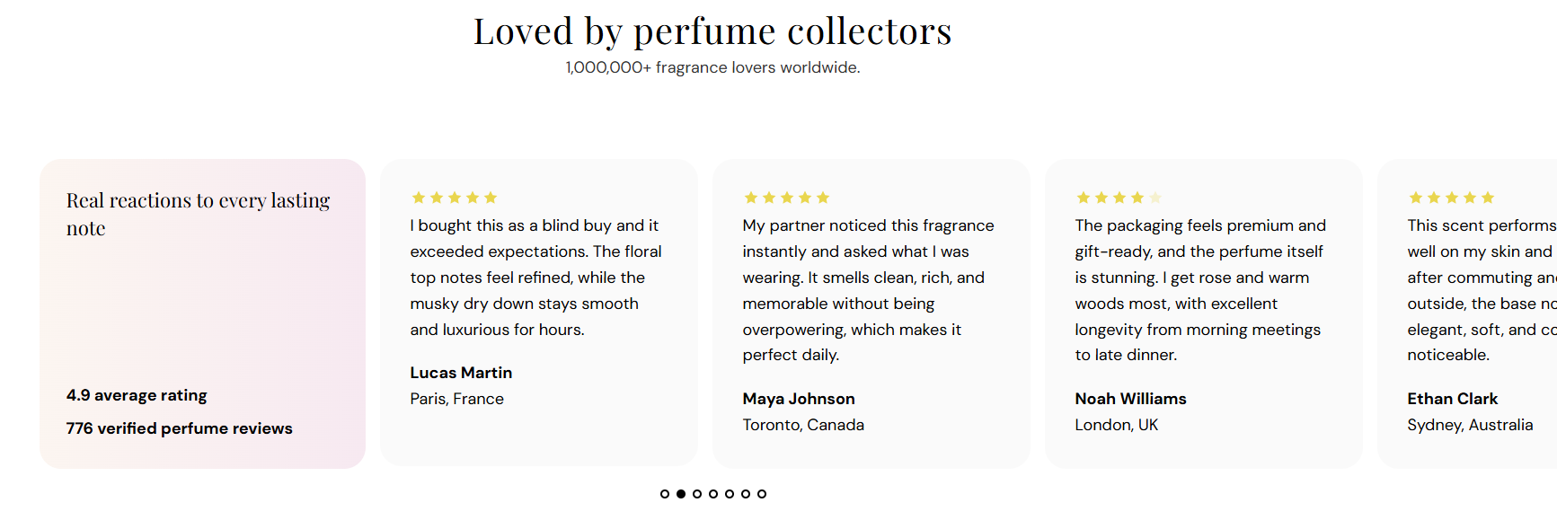
Main title centered above the summary card and review slider (for example Loved by perfume collectors).

Usage

  • Keep it short and focused on customer satisfaction or community.
  • Leave blank to hide the heading and show only the subheading or review area.

Subheading

Supporting line shown below the heading (for example 1,000,000+ fragrance lovers worldwide.).

Usage

  • Use one line to reinforce scale, reach, or review volume.
  • Leave blank if the heading alone is enough context.

Summary card content

Heading

Title inside the left summary card (for example Real reactions to every lasting note).

Usage

  • Introduce the review stats or theme of the testimonial row.
  • Leave blank to show only the stat lines below.

Line 1 text

First stat line in bold inside the summary card (for example 4.9 average rating).

Usage

  • Highlight your strongest review metric.
  • Leave blank to hide this line.

Line 2 text

Second stat line in bold below line 1 (for example 776 verified perfume reviews).

Usage

  • Add a supporting number such as review count or repeat customers.
  • Leave blank to show only line 1.

Summary card appearance

Text color

Color for the heading and stat lines inside the summary card. Default color: #000000.

Usage

  • Ensure readable contrast against the card background you choose.
  • Applies to all text inside the summary card only.

Background style

Chooses a flat color or gradient behind the summary card. Options: Solid or Gradient. Default: Gradient.

When you pick Solid

  • One flat color fills the summary card.
  • Editor shows the Solid background color picker.

When you pick Gradient

  • A color blend fills the summary card.
  • Editor shows the Gradient background preset picker.

Solid background

Flat fill color for the summary card when Background style is set to Solid. Default color: #FFF5F0.

Usage

  • Use a soft warm tone that complements fragrance branding.
  • Only visible when Background style is Solid.

Gradient background

Gradient preset for the summary card when Background style is set to Gradient. Default is a warm peach-to-blush blend.

Usage

  • Pick a preset from the gradient editor that matches your brand palette.
  • Only visible when Background style is Gradient.

Card corner radius

Rounds the corners of the summary card using presets from Theme settings → Border radius. Default: Extra large radius.

Usage

  • Match the radius used on review cards and other rounded elements on your store.
  • Applies only to the summary card, not individual review slides.

Review cards

Card background

Background color for each review slide in the slideshow. Default color: #FAFAFA.

Usage

  • Use a light neutral so customer photos and quotes stand out.
  • Applies to every review block in the slider for a consistent row.

Text color

Color for the review quote, author name, and customer info on each slide. Default color: #000000.

Usage

  • Ensure strong contrast against the card background.
  • Applies to all text inside each review slide.

Star color

Fill color for active stars on each review slide. Default color: #F7D034.

Usage

  • Use a warm gold tone for familiar review-star styling.
  • Applies to stars on every review block in the slider.

Slideshow controls

Show pagination dots

Shows dot indicators below the review slider so customers can see how many reviews are in the slideshow. Default: On.

When turned on

  • Dots appear below the slider when there is more than one review block.
  • Customers can click a dot to jump to that review.

When turned off

  • No dots appear below the slider.
  • Customers rely on autoplay or swipe to move between reviews.

Autoplay

Automatically advances the slideshow between review blocks. Default: On.

When turned on

  • Slides change automatically after the time set in Autoplay speed.
  • Only runs when there is more than one review block.

When turned off

  • Reviews stay on the current slide until the customer swipes or uses pagination dots.

Autoplay speed

Time each review stays visible before the slideshow advances. Range: 2–10 s, step 2. Default: 6 s.

Usage

  • When you move the slider, the pause between slides grows or shrinks.
  • Only applies when Autoplay is turned on and there are multiple reviews.
  • Use a longer speed when review quotes are lengthy so customers have time to read.

Dot color

Color for pagination dots below the slider. Default color: #000000.

Usage

  • Pick a color that stands out against the section background.
  • Only visible when Show pagination dots is turned on.

Review block

Customer image

Uploads a photo shown at the top of this review slide—typically a customer portrait or product-in-use shot.

Usage

  • Add one Review block per testimonial with Add Review.
  • Best width: about 80 px. For sharp retina screens, upload a image at 160 px.
  • Leave blank to show the review without a photo.

Alt text

Describes the customer image for screen readers and search engines. If left blank, the author name is used as a fallback.

Usage

  • Describe who or what appears in the photo (for example Portrait of Aanya Patel).
  • Do not use generic text like “customer photo.”

Rating

Sets how many stars appear filled for this review. Range: 3–5. Default: 5.

Usage

  • Match each block to the actual rating for that testimonial.
  • When you move the slider, the filled stars update on this slide only.

Review description

The customer quote shown on this slide. Keep it authentic and specific to your products or shopping experience.

Usage

  • Use real feedback about scent, longevity, packaging, or gifting.
  • Leave blank to hide the quote while keeping stars and author info.

Author name

Customer name shown in bold below the review quote (for example Aanya Patel).

Usage

  • Use the reviewer’s first name and last initial if you prefer partial names.
  • Leave blank to hide the author line.

Customer info

Secondary line below the author—often a location, role, or product reference (for example Toronto, Canada or City, Country).

Usage

  • Add location or product details to make testimonials feel specific and credible.
  • Leave blank to show only the author name.

Section spacing

Section spacing

Adds empty space above and below this section on desktop and mobile.

Usage

  • Top padding (desktop) — Default: 40 px · 0–100 px
  • Bottom padding (desktop) — Default: 40 px · 0–100 px
  • Top padding (mobile) — Default: 40 px · 0–100 px
  • Bottom padding (mobile) — Default: 40 px · 0–100 px
  • When you move the slider, the gap above or below grows or shrinks