Theme Sections

Filtered product list

Filtered product list shows a grid or slideshow of products that match rules you set—price, metafield value, or inventory level. Choose a source collection or search your whole catalog, then display matching products with a heading and optional subheading.

Storefront preview

Filtered product list section preview on the Fragrance Shop storefront

Storefront preview

Where to find this section

Filtered product list in the Add section list under Products

Theme editor section picker

Content

Heading

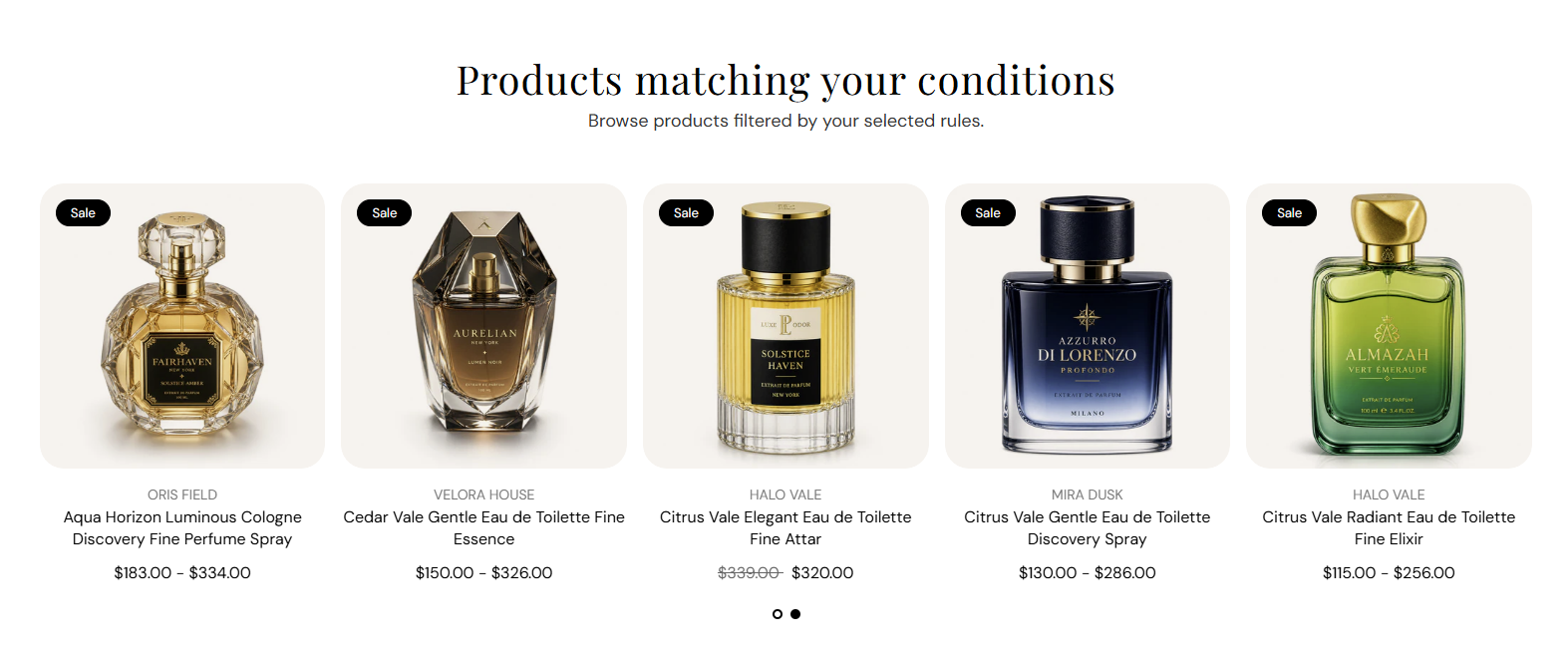
Main title above the product grid or slideshow. Default: Products matching your conditions. Leave blank to hide the heading.

Usage

  • Describe what the filtered list shows (for example premium scents over $100).
  • Keep to one line for a clean layout above the product cards.

Subheading

Supporting line under the heading. Default: Browse products filtered by your selected rules. Leave blank to show the heading only.

Usage

  • Add a short sentence that explains the filter rules in plain language.
  • Leave blank when the heading alone is enough context.

Product source collection

Product source collection

Limits which products can appear in this section. Filters run only against products in the selected collection. If no collection is selected, products from your entire store are searched.

Usage

  • Pick a collection such as All fragrances or Best sellers to narrow the starting pool.
  • Leave empty to filter across every product in your catalog.
  • Price, metafield, and inventory rules apply on top of this source collection.

Price condition

Price operator

Compares each product price against the value you enter. Options: Less than, Greater than, or Equal to. Default: Greater than.

Usage

  • Use Greater than with a value like 100 to show premium-priced scents.
  • Use Less than for budget-friendly or mini-size product rows.

Price value

The amount used with the price operator. Uses your store currency. Default: 100. Leave empty to disable price filtering.

Usage

  • Enter a whole number that matches how you price products in the admin.
  • Clear the field when you do not want price to affect which products appear.

Metafield condition

Metafield namespace and key

Shows products that have a value set for this metafield. Enter in namespace.key format (for example custom.fragrance_family). Leave empty to disable metafield filtering.

Usage

  • Use product metafields you already maintain for scent family, notes, or season.
  • Only products with a value on this metafield are included when the field has text.
  • Clear the field when metafields should not affect the product list.

Inventory condition

Inventory operator

Compares total inventory across all variants against the inventory value you enter. Options: Less than, Greater than, or Equal to. Default: Less than.

Usage

  • Use Less than to highlight low-stock or last-chance items.
  • Use Greater than to show only well-stocked products.

Inventory value

The stock level used with the inventory operator. Products are matched using combined inventory across all variants. Leave empty to disable inventory filtering.

Usage

  • Pair with Less than and a small number (for example 5) for scarcity messaging.
  • Clear the field when inventory should not filter the list.

Product limit

Product limit

Maximum number of matching products shown in this section. Range: 1–24. Default: 8.

Usage

  • Use a lower limit (4–8) for a focused row on landing pages.
  • Increase toward 24 when you need a fuller catalog-style grid.
  • Only products that pass all active filters count toward this limit.

Product layout

Layout

Displays matching products as a static grid or a swipeable slideshow. Options: Product list or Product slideshow. Default: Product list.

Usage

  • Use Product list for a full grid customers can scan at once.
  • Switch to Product slideshow to save vertical space on busy pages.

Columns on desktop

Number of product cards per row on desktop screens. Range: 2–5 columns. Default: 4.

Usage

  • Use 4 or 5 columns for dense catalog-style rows.
  • Use 2 or 3 columns when product images need more space.

Columns on tablet

Number of product cards per row on tablet screens. Range: 2–4 columns. Default: 3.

Usage

  • Typically one column fewer than desktop for comfortable tap targets.
  • Applies to both list and slideshow layouts.

Columns on mobile

Number of product cards per row on phone screens. Range: 1–2 columns. Default: 2.

Usage

  • Use 2 columns for compact mobile grids.
  • Use 1 column when each product card should fill the screen width.

Slideshow controls

Show pagination dots

Shows dot indicators below the slideshow so customers know how many slides exist and which slide is active. Default: On. Applies when layout is Product slideshow.

Usage

  • Leave on for clearer navigation when you have several slides of products.
  • Turn off for a cleaner look if arrows or swipe alone is enough.

Autoplay

Automatically advances the slideshow through product slides. Default: Off. Applies when layout is Product slideshow.

Usage

  • Turn on for a passive browsing experience on promotional pages.
  • Leave off when you want customers to control slide changes themselves.

Autoplay speed

Seconds each slide stays visible before autoplay moves to the next one. Range: 2–10 s, step 2. Default: 6 s. Applies when layout is Product slideshow and autoplay is on.

Usage

  • Use 6–10 seconds so customers have time to read product titles and prices.
  • Has no effect when autoplay is off or layout is Product list.

Dot color

Color of the active and inactive pagination dots. Default color: #000000. Applies when layout is Product slideshow and pagination dots are shown.

Usage

  • Match dot color to your section heading or brand accent for a cohesive row.
  • Ensure enough contrast against the section background.

Section spacing

Section spacing

Adds empty space above and below this section on desktop and mobile.

Usage

  • Top padding (desktop) — Default: 40 px · 0–100 px
  • Bottom padding (desktop) — Default: 40 px · 0–100 px
  • Top padding (mobile) — Default: 40 px · 0–100 px
  • Bottom padding (mobile) — Default: 40 px · 0–100 px
  • When you move the slider, the gap above or below grows or shrinks