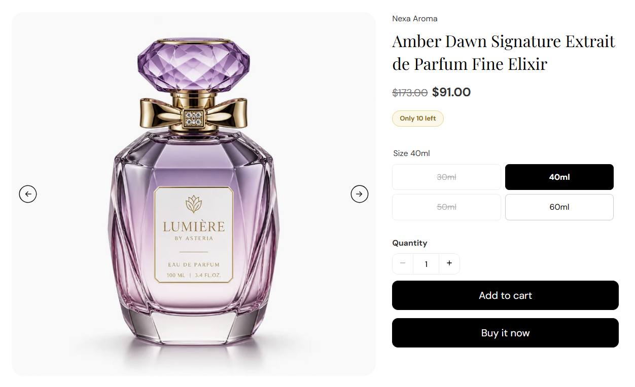
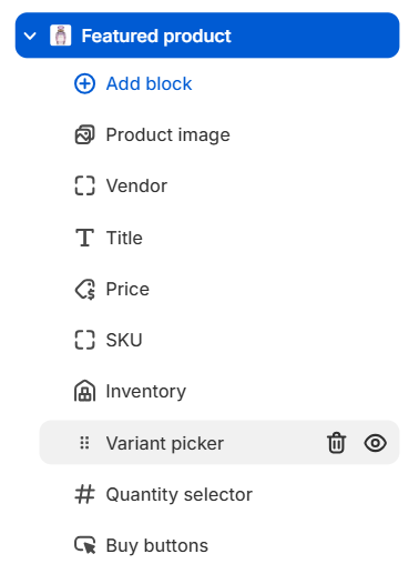
FFragrance ShopDocs
Welcome & Theme Introduction
Theme Installation
Install from Shopify Theme StoreInstall from ZIP File
Overview
Brand identity
Store logoStore name fallbackBrowser icon
Border radius
Colors and schemes
Page colorsText colorsDivider colorsPrimary buttonSecondary buttonTertiary buttonArrow buttonForm fieldsDropdownsProduct option buttonsSelected Product option buttons
Typography
FontsBody textHeading textSection headingsPage headings
Layout and spacing
Buttons
Primary and secondaryTertiary buttonArrow button
Form fields
Text inputsDropdowns
Search
Predictive search
Customer accounts
Account navigation
Social media
Profile linksIcon color
Product cards
BadgesProduct imageProduct details
Product compare
Compare feature and limitCompare tableCustom comparison fields
Breadcrumbs
Visibility by page type
Cart page
Follow on Shop
Follow on Shop
Custom CSS
Announcement Bar
LocalizationAnnouncement banner
Header
Featured navigationMega MenuMobile MenuMobile menu localization
Footer
Main footerStore informationFooter navigationNewsletterFooter bottomLocalizationPayment icons
Home PageCollections List PageCollection PageProduct PageBlog PageArticle PageCart PageSearch PageStandard PageContact PagePassword Page404 PageGift Card Page
Banner with benefitsFeatured banner gridImage banner gridProduct bannerPromotional bannerSplit image banner
Hero slideshowImage slideshow
Collapsible image contentFull-width mediaImage galleryImage with textProduct showcase
AnnouncementCall to action cardsScrolling text
Editorial product featureFeatured collectionFeatured productFiltered product listHand-picked productsProduct descriptionProduct videosRecommended products
Collection list
Benefits barProduct benefitsReviews and logosTestimonialsTrust indicators
FAQRich text
Contact formNewsletter
Blog posts
Apps blockCustom Liquid
Version HistoryChangelog
Support PolicyContact Support
FAQ
Docs/Theme Sections/Featured product
Theme Sections

Featured product

Featured product highlights one product on any page template. Choose the product in section settings, then add blocks for the image gallery, title, price, variant picker, and buy buttons so customers can shop without leaving the page.

Storefront preview

Featured product section preview on the Fragrance Shop storefront

Storefront preview

Where to find this section

Where to find this

Themes → Customize → Add section → Featured product

Find it under Products in the section picker. After adding the section, use Add block in the sidebar to add image, title, price, variant picker, and buy button blocks.

Featured product section and blocks in the Fragrance Shop theme editor

Theme editor → Featured product → blocks

Product

Featured product product picker in the Fragrance Shop Shopify theme editor

Theme editor settings

Product

Selects which product this section displays. Search your catalog or pick from the product list. There is no default product—you must choose one before the section shows content on the storefront.

Usage

  • Pick a hero scent, new launch, or gift set you want to spotlight on the page.
  • All blocks pull data from this product—title, price, images, variants, and inventory.
  • Change the product anytime without rebuilding the section blocks.

Section spacing

Featured product section spacing settings in the Fragrance Shop Shopify theme editor

Theme editor settings

Section spacing

Adds empty space above and below this section on desktop and mobile.

Usage

  • Top padding (desktop) — Default: 40 px · 0–100 px
  • Bottom padding (desktop) — Default: 40 px · 0–100 px
  • Top padding (mobile) — Default: 40 px · 0–100 px
  • Bottom padding (mobile) — Default: 40 px · 0–100 px
  • When you move the slider, the gap above or below grows or shrinks

Product image block

Product image block settings for the Featured product section in the Fragrance Shop Shopify theme editor

Theme editor settings

Media width

Sets how much horizontal space the product media column uses beside the product details. Options: Small (50%), Medium (60%), or Large (70%). Default: Medium (60%).

Usage

  • Use Large when the product image is the main visual focus.
  • Use Small when you want more room for title, variants, and buy buttons.

Image ratio

Crops product media to a fixed aspect ratio. Default: 1:1.

Usage

  • 1:1 works well for bottle and box shots on fragrance product pages.
  • Pick a taller ratio (for example 2:3) for editorial-style product photography.

Image background color

Fill color behind the product image when the photo does not cover the full frame. Default color: #FAFAFA.

Usage

  • Match your page background or use a soft neutral so bottle shots feel clean.
  • Most visible when Image fit is set to Contain.

Image corner radius

Rounds the corners of the product media frame using your theme radius presets. Default: Extra large (radius_4).

Usage

  • Lower presets give a sharper, editorial look; higher presets feel softer and more premium.
  • Radius values come from Theme settings → Border radius.

Image fit

Choose how the image fills its frame. Cover fills the frame and may crop edges; Contain shows the full image with possible letterboxing. Default: Cover.

Usage

  • Use Cover for consistent grid-style product shots.
  • Use Contain when you need the full bottle or packaging visible without cropping.

Image filter

Applies a visual blend between the product image and its background color. Options: Normal or Mix blend. Default: Normal.

Usage

  • Keep Normal for standard product photography.
  • Try Mix blend for a softer, tinted look against the background color.

Show arrows

Shows previous and next arrows when the product has multiple images. Default: On.

Usage

  • Leave on so customers can browse all product photos in the gallery.
  • Turn off for a minimal single-image layout.

Autoplay

Automatically advances through product images when more than one image exists. Default: On.

Usage

  • Pair with Autoplay speed to control how quickly images change.
  • Turn off if you prefer customers to move through images manually with arrows only.

Autoplay speed

Seconds each image stays visible before autoplay moves to the next slide. Range: 2–10 seconds. Default: 5 seconds.

Usage

  • Use a slower speed (7–10 seconds) so customers have time to view each angle.
  • Only applies when Autoplay is on and the product has multiple images.

Arrow color

Color of the gallery navigation arrows. Default color: #111111.

Usage

  • Pick a dark tone for light product backgrounds, or a lighter color on dark imagery.
  • Ensure enough contrast so arrows remain easy to see on every slide.

Variant picker block

Variant picker block settings for the Featured product section in the Fragrance Shop Shopify theme editor

Theme editor settings

Picker style

Choose how customers pick product options such as size or scent concentration. Options: Dropdown or Swatch buttons. Default: Swatch buttons.

Usage

  • Use Swatch buttons when options are short labels customers can scan quickly.
  • Use Dropdown when a product has many variants or long option names.

Show color swatches

Shows color swatches or swatch images on option buttons when picker style is Swatch buttons. Configure swatches on each product in the admin. Default: Off.

Usage

  • Turn on for color-based options such as bottle cap or packaging color.
  • Has no effect when picker style is set to Dropdown.

Inventory block

Inventory block settings for the Featured product section in the Fragrance Shop Shopify theme editor

Theme editor settings

Low-stock threshold

Shows a low-stock message when inventory is at or below this number. Default: 10 · Range: 1–20.

Usage

  • Lower the number to trigger low-stock messaging sooner on limited-edition scents.
  • Customers see in-stock, low-stock, or out-of-stock text based on the selected variant.

Buy buttons block

Buy buttons block settings for the Featured product section in the Fragrance Shop Shopify theme editor

Theme editor settings

Add to cart button style

Sets the style for the main add-to-cart button. Options: Primary or Secondary. Default: Primary.

Usage

  • Use Primary when this section is the main purchase action on the page.
  • Use Secondary for a softer button that matches supporting sections.

Show accelerated checkout buttons

Shows Shop Pay and other dynamic checkout buttons beside add to cart when available. Default: On.

Usage

  • Turn on to offer faster checkout options on the featured product.
  • Turn off for a single add-to-cart action only.

Accelerated checkout button style

Sets the style for dynamic checkout buttons. Options: Default, Primary, or Secondary. Default: Default.

Usage

  • Match accelerated checkout buttons to your add-to-cart style for a unified row.
  • Use Default to follow the payment provider’s standard button look.