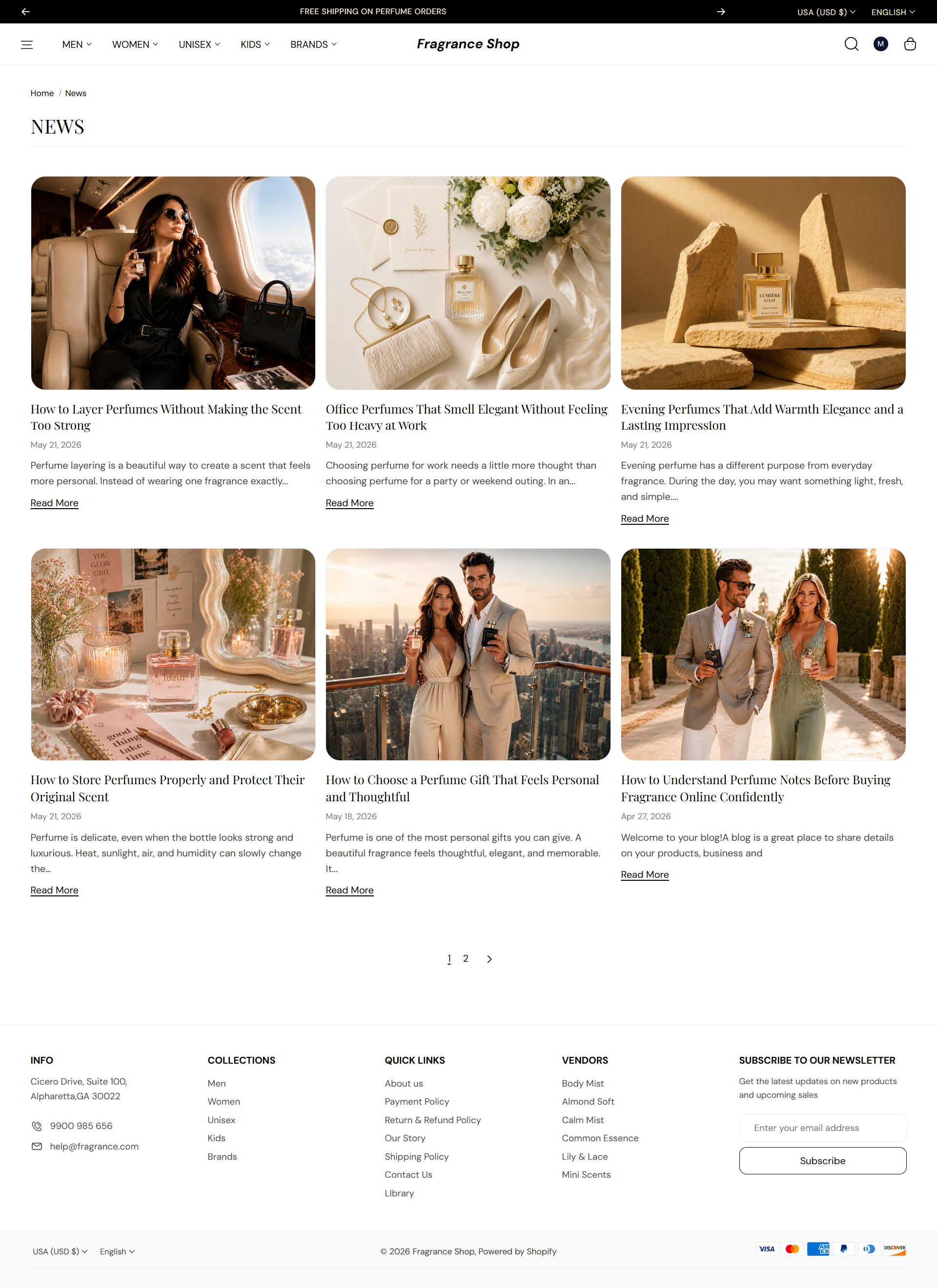
Shopify Pages

Blog Page

The Blog page lists your articles as cards with image, title, and excerpt. Use the theme editor to set the grid layout, card style, and how much text shows before customers open a full post.

Storefront preview

Fragrance Shop blog page showing article cards in a grid layout

Storefront → Blog page

How to open this page

Blog template with Blog section in the Fragrance Shop theme editor sidebar

Theme editor → Blog → Template

Blog layout

Layout

Chooses how article cards are arranged on the page. Default: Grid

Usage

  • Pick Grid for a visual magazine-style listing with featured images.
  • Pick List for a stacked layout that emphasizes titles and excerpts.

Columns on desktop

Sets how many article cards appear per row when Grid layout is selected. Default: 3 columns · Options: 2–4

Usage

  • Use fewer columns when article titles or excerpts are long.
  • This setting only applies on large screens in grid layout.

Show blog tag filter

Adds a dropdown so visitors can filter articles by tag. Hidden automatically when the blog has no tags. Default: Off

Usage

  • Turn on when you tag posts by topic, such as Skincare or New arrivals.
  • Turn off for a cleaner page when you publish to one topic only.

Article cards

Image ratio

Sets the aspect ratio for each article's featured image. Default: 4:3 – Standard

Usage

  • Pick Auto to show the full image without cropping.
  • Fixed ratios crop images to keep the grid visually even.

Image corner radius

Rounds the corners of article images using your theme's border radius presets. Default: Extra large radius

Usage

Article content

Articles per page

Sets how many posts appear before pagination. Default: 6 · Range: 2–24

Usage

  • Use a lower number for editorial blogs with long excerpts.
  • Use a higher number when you publish frequently and want fewer page clicks.

Show published date

Shows when each article was published on the card. Default: On

Usage

  • Turn on for news, launches, or seasonal content where timing matters.
  • Turn off for evergreen guides that should not feel dated.

Show blog comment count

Shows how many comments each article has received. Default: Off

Usage

  • Turn on if you enable comments and want to highlight active discussions.

Show author name

Shows the author credited on each article card. Default: Off

Usage

  • Turn on for expert-led content or multi-author editorial blogs.

Excerpt word count

Sets how many words appear in each article preview before the read-more link. Default: 20 · Range: 10–80

Usage

  • Lower the count for a tighter grid with shorter cards.
  • Raise it when you want more context before customers open the full article.

Show read more link

Adds a link below each excerpt that opens the full article. Default: On

Usage

  • Turn off if the whole card is already clickable and you want a cleaner layout.

Read more link label

Sets the text on the read-more link. Default: Read More

Usage

  • Try Read article or Discover more to match your brand voice.
  • Leave blank only if Show read more link is turned off.

Section spacing

Section spacing

Adds empty space above and below this section on desktop and mobile.

Usage

  • Top padding (desktop) — Default: 40 px · 0–100 px
  • Bottom padding (desktop) — Default: 40 px · 0–100 px
  • Top padding (mobile) — Default: 40 px · 0–100 px
  • Bottom padding (mobile) — Default: 40 px · 0–100 px
  • When you move the slider, the gap above or below grows or shrinks