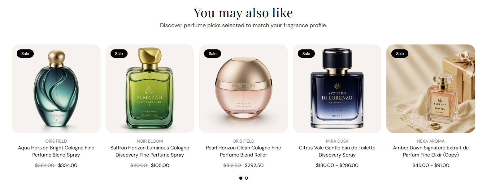
FFragrance ShopDocs
Welcome & Theme Introduction
Theme Installation
Install from Shopify Theme StoreInstall from ZIP File
Overview
Brand identity
Store logoStore name fallbackBrowser icon
Border radius
Colors and schemes
Page colorsText colorsDivider colorsPrimary buttonSecondary buttonTertiary buttonArrow buttonForm fieldsDropdownsProduct option buttonsSelected Product option buttons
Typography
FontsBody textHeading textSection headingsPage headings
Layout and spacing
Buttons
Primary and secondaryTertiary buttonArrow button
Form fields
Text inputsDropdowns
Search
Predictive search
Customer accounts
Account navigation
Social media
Profile linksIcon color
Product cards
BadgesProduct imageProduct details
Product compare
Compare feature and limitCompare tableCustom comparison fields
Breadcrumbs
Visibility by page type
Cart page
Follow on Shop
Follow on Shop
Custom CSS
Announcement Bar
LocalizationAnnouncement banner
Header
Featured navigationMega MenuMobile MenuMobile menu localization
Footer
Main footerStore informationFooter navigationNewsletterFooter bottomLocalizationPayment icons
Home PageCollections List PageCollection PageProduct PageBlog PageArticle PageCart PageSearch PageStandard PageContact PagePassword Page404 PageGift Card Page
Banner with benefitsFeatured banner gridImage banner gridProduct bannerPromotional bannerSplit image banner
Hero slideshowImage slideshow
Collapsible image contentFull-width mediaImage galleryImage with textProduct showcase
AnnouncementCall to action cardsScrolling text
Editorial product featureFeatured collectionFeatured productFiltered product listHand-picked productsProduct descriptionProduct videosRecommended products
Collection list
Benefits barProduct benefitsReviews and logosTestimonialsTrust indicators
FAQRich text
Contact formNewsletter
Blog posts
Apps blockCustom Liquid
Version HistoryChangelog
Support PolicyContact Support
FAQ
Docs/Theme Sections/Recommended products
Theme Sections

Recommended products

Recommended products shows Shopify-powered related or complementary fragrances below the product details. Choose the recommendation type, set a heading and subheading, pick a product list or slideshow layout, and control how many products appear.

Storefront preview

Recommended products section preview on the Fragrance Shop product page

Storefront preview

Where to find this section

Where to find this

Themes → Customize → Products → Default product → Recommended products

This section is available on the product page template only. Select it in the left panel or click it in the preview to edit settings.

Recommended products section on the Default product template in the Fragrance Shop theme editor

Theme editor → Default product template

Recommendation source

Recommended products recommendation source settings in the Fragrance Shop Shopify theme editor

Theme editor settings

Recommendation type

Choose which Shopify recommendations to show: Related products surfaces similar items; Complementary products surfaces add-on or pairing suggestions. Configure both lists in the Search and Discovery app. Default: Related products.

Usage

  • Use Related products for “customers also viewed” style suggestions.
  • Use Complementary products for gift sets, minis, or layering pairs.
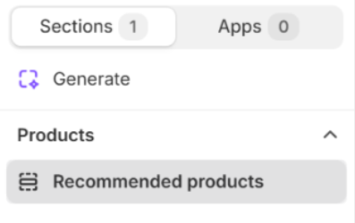
  • Add two Recommended products sections on the product page to show both lists.

Content

Recommended products content settings in the Fragrance Shop Shopify theme editor

Theme editor settings

Heading

Main title above the product row (for example You may also like). Default: You may also like. Leave blank to use the theme’s fallback heading.

Usage

  • Match the heading to the recommendation type (Related vs Complementary).
  • Keep to one line for a clean layout above the product cards.

Subheading

Supporting line under the heading (for example Discover perfume picks selected to match your fragrance profile.). Default: Discover perfume picks selected to match your fragrance profile. Leave blank to hide the subheading.

Usage

  • Add one sentence that explains why these products appear.
  • Leave blank for a heading-only section.

Layout

Recommended products layout settings in the Fragrance Shop Shopify theme editor

Theme editor settings

Layout

Choose how products appear on the storefront: Product list shows a grid of cards; Product slideshow shows one row with swipe or arrow navigation. Default: Product list.

Usage

  • Pick Product list when you want several recommendations visible at once.
  • Pick Product slideshow when space is limited or you show many products.

Products to show

Maximum number of recommended products displayed. Range: 1–10. Default: 10.

Usage

  • Lower the count for a shorter product page.
  • Shopify fills the row from your Search and Discovery recommendations.

Product grid

Recommended products grid column settings in the Fragrance Shop Shopify theme editor

Theme editor settings

Columns on desktop

Number of product cards per row on large screens. Options: 2–5. Default: 4.

Usage

  • Use 4 or 5 for a full-width product row on desktop.
  • Applies to both Product list and Product slideshow layouts.

Columns on tablet

Number of product cards per row on tablet screens. Options: 2–4. Default: 3.

Usage

  • 3 balances readability and product count on medium screens.
  • Lower the count if product titles wrap to multiple lines.

Columns on mobile

Number of product cards per row on phones. Options: 1–2. Default: 2.

Usage

  • Use 2 to show a compact pair of cards side by side.
  • Use 1 for larger product images on small screens.

Slideshow

Recommended products slideshow settings in the Fragrance Shop Shopify theme editor

Theme editor settings

Show pagination dots

Shows dot indicators below the slideshow so customers can jump between slides. Default: On.

Usage

  • Keep on when the slideshow has more products than fit in one view.
  • Turn off for a minimal look when arrows alone are enough.

Enable autoplay

Automatically advances slides after the time set in Autoplay speed. Default: Off.

Usage

  • Turn on to rotate products without customer interaction.
  • Leave off so customers control pacing—recommended for product browsing.

Autoplay speed

Seconds each slide stays visible before advancing when autoplay is on. Range: 2–10 s, step 2. Default: 6 s.

Usage

  • Use 6–8 s so customers have time to read product names.
  • Only applies when Enable autoplay is turned on.

Dot color

Color of the pagination dots below the slideshow. Default color: #000000.

Usage

  • Pick a color with enough contrast against the section background.
  • Applies only when Show pagination dots is on.

Section spacing

Recommended products section spacing settings in the Fragrance Shop Shopify theme editor

Theme editor settings

Section spacing

Adds empty space above and below this section on desktop and mobile.

Usage

  • Top padding (desktop) — Default: 40 px · 0–100 px
  • Bottom padding (desktop) — Default: 40 px · 0–100 px
  • Top padding (mobile) — Default: 40 px · 0–100 px
  • Bottom padding (mobile) — Default: 40 px · 0–100 px
  • When you move the slider, the gap above or below grows or shrinks