Heading
Sets the main title shown above the blog slider.
Usage
- Keep it short so customers understand the section at a glance.
- Leave blank to hide the heading and show only the post slider.
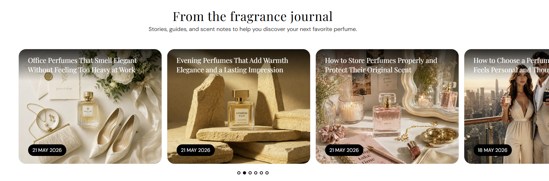
Shows a heading and a horizontal slider of recent articles from blogs you create in Shopify admin. Choose how many posts to show in this section—use it on the home page, blog areas, or any template where you want editorial content with optional date badges and slideshow controls.
Storefront preview
Themes → Customize → Add section → Blog posts
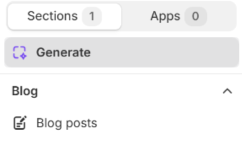
Theme editor section list
Sets the main title shown above the blog slider.
Usage
Adds supporting text below the heading.
Usage
Chooses which blog’s articles appear in this section. Only blogs you have created in your store are listed (for example News).
Usage
Sets the aspect ratio for each post’s featured image. Auto shows the full image; fixed ratios may crop. Default: 5:4 – Soft.
Usage
Rounds the corners of each post image using your global border radius presets from Theme settings → Border radius. Default: Extra large radius.
Usage
Sets how many articles load in the slider. Range: 6–15. Default: 6.
Usage
Sets the color of each article title on the post card. Default color: #FFFFFF.
Usage
Shows a date badge on each post card when turned on. Default: On.
Usage
Sets the date badge background. Default color: #000000.
Usage
Sets the date badge text color. Default color: #FFFFFF.
Usage
Shows dots under the slider when more than one post is visible. Default: On.
Usage
Automatically advances slides when turned on and multiple posts exist. Default: On.
Usage
Seconds each slide stays visible when autoplay is on. Range: 2–10 s (step 2). Default: 6 s.
Usage
Sets the color of pagination dots. Default color: #000000.
Usage
Adds empty space above and below this section on desktop and mobile.
Usage