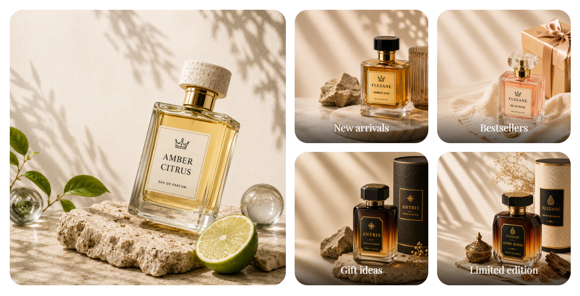
FFragrance ShopDocs
Welcome & Theme Introduction
Theme Installation
Install from Shopify Theme StoreInstall from ZIP File
Overview
Brand identity
Store logoStore name fallbackBrowser icon
Border radius
Colors and schemes
Page colorsText colorsDivider colorsPrimary buttonSecondary buttonTertiary buttonArrow buttonForm fieldsDropdownsProduct option buttonsSelected Product option buttons
Typography
FontsBody textHeading textSection headingsPage headings
Layout and spacing
Buttons
Primary and secondaryTertiary buttonArrow button
Form fields
Text inputsDropdowns
Search
Predictive search
Customer accounts
Account navigation
Social media
Profile linksIcon color
Product cards
BadgesProduct imageProduct details
Product compare
Compare feature and limitCompare tableCustom comparison fields
Breadcrumbs
Visibility by page type
Cart page
Follow on Shop
Follow on Shop
Custom CSS
Announcement Bar
LocalizationAnnouncement banner
Header
Featured navigationMega MenuMobile MenuMobile menu localization
Footer
Main footerStore informationFooter navigationNewsletterFooter bottomLocalizationPayment icons
Home PageCollections List PageCollection PageProduct PageBlog PageArticle PageCart PageSearch PageStandard PageContact PagePassword Page404 PageGift Card Page
Banner with benefitsFeatured banner gridImage banner gridProduct bannerPromotional bannerSplit image banner
Hero slideshowImage slideshow
Collapsible image contentFull-width mediaImage galleryImage with textProduct showcase
AnnouncementCall to action cardsScrolling text
Editorial product featureFeatured collectionFeatured productFiltered product listHand-picked productsProduct descriptionProduct videosRecommended products
Collection list
Benefits barProduct benefitsReviews and logosTestimonialsTrust indicators
FAQRich text
Contact formNewsletter
Blog posts
Apps blockCustom Liquid
Version HistoryChangelog
Support PolicyContact Support
FAQ
Docs/Theme Sections/Featured banner grid
Theme Sections

Featured banner grid

Featured banner grid shows one large image on the left and four smaller linked banners on the right. Use it to highlight collections, campaigns, or seasonal edits in a balanced editorial layout.

Storefront preview

Featured banner grid section preview on the Fragrance Shop storefront

Storefront preview

Where to find this section

Where to find this

Themes → Customize → Add section → Featured banner grid

After adding the section, configure the Large banner in section settings and add up to 4 Small banner blocks.

Featured banner grid section and blocks in the Shopify theme editor

Theme editor section list

Banner style

Featured banner grid image corner radius settings in the Fragrance Shop Shopify theme editor

Theme editor settings

Image corner radius

Sets rounded corners for all banner images in this section using your global border radius presets. Default: Extra large radius.

Usage

  • Pick a radius preset that matches your store’s overall corner style.
  • Uses the same presets as Theme settings → Border radius, so banners stay consistent sitewide.
  • Preview on desktop and mobile to confirm the grid still feels balanced.

Large banner

Featured banner grid large banner settings in the Fragrance Shop Shopify theme editor

Theme editor settings

Image

Uploads the main left-column banner image. Recommended size: 750 px wide; use 1500 px for sharper retina screens.

Usage

  • Use a strong lifestyle or product image that anchors the grid visually.
  • Keep important details away from tight crops on smaller screens.
  • If no image is uploaded, a placeholder appears until you add one.

Image alt text

Adds descriptive text for screen readers and SEO when the image is decorative or needs context.

Usage

  • Describe what is shown in the image in a short, natural phrase.
  • Leave blank only when the image is purely decorative and nearby text already explains it.

Link

Makes the large banner clickable to a collection, product, page, or external URL.

Usage

  • Paste a link or search for a destination in your store.
  • Without a link, the banner is not clickable.

Open in new tab

Opens the large banner link in a new browser tab when enabled. Default: Off.

Usage

  • Turn on only for external links where you want customers to keep your store open.
  • Keep off for internal collection and product links for a smoother shopping flow.

Small banner block

Small banner block settings for the Featured banner grid section in the Fragrance Shop Shopify theme editor

Theme editor settings

Image

Uploads the image for each small banner tile. Recommended size: 370 px wide; use 740 px for retina quality.

Usage

  • Add one Small banner block per tile (up to 4).
  • Use clear, cropped images so headings stay readable over the photo.

Image alt text

Adds accessibility text for each small banner image.

Usage

  • Describe the image or the offer when it adds meaning beyond the heading.
  • Keep alt text short and specific to each tile.

Heading

Sets the label shown over each small banner (for example, New arrivals or Bestsellers).

Usage

  • Keep headings short so they fit cleanly on the image.
  • Use action-oriented labels that match where the link goes.
  • Leave blank to show image only with no text overlay.

Heading color

Sets the color of the heading text on each small banner. Default color: #FFFFFF.

Usage

  • Choose a color with strong contrast against the banner image.
  • Test all four tiles—images with different brightness may need different colors.

Link

Makes each small banner clickable to a collection, product, or page.

Usage

  • Link each tile to the destination that matches its heading.
  • Without a link, the tile is not clickable.

Open in new tab

Opens the small banner link in a new tab when enabled. Default: Off.

Usage

  • Use for external URLs; keep off for in-store collection and product links.
  • Set per block so each tile can behave differently if needed.

Section spacing

Featured banner grid section spacing settings in the Fragrance Shop Shopify theme editor

Theme editor settings

Section spacing

Adds empty space above and below this section on desktop and mobile.

Usage

  • Top padding (desktop) — Default: 40 px · 0–100 px
  • Bottom padding (desktop) — Default: 40 px · 0–100 px
  • Top padding (mobile) — Default: 40 px · 0–100 px
  • Bottom padding (mobile) — Default: 40 px · 0–100 px
  • When you move the slider, the gap above or below grows or shrinks