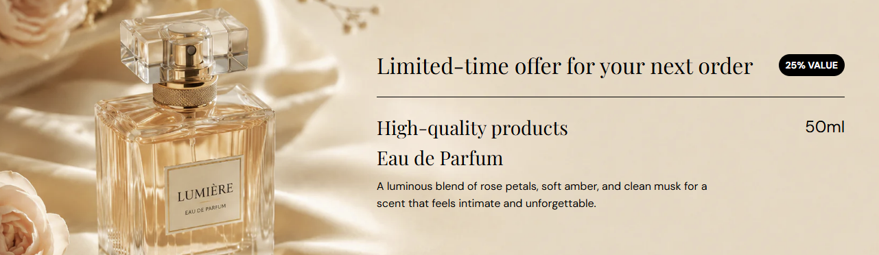
Theme Sections

Promotional banner

Promotional banner is a full-width hero strip with optional background image, overlay, promo badge, and stacked copy—eyebrow, two heading lines, description, and a value label on the right. Use it for limited offers, hero launches, or product highlights.

Storefront preview

Promotional banner section preview on the Fragrance Shop storefront

Storefront preview

Where to find this section

Promotional banner in the Add section list under Banners and heroes

Theme editor section picker

Background and appearance

Background image

Uploads the banner background photo. Recommended size: 2000 px wide; use 4000 px for retina quality.

Usage

  • Use a wide hero image with space for text on the left or center.
  • Leave empty to show only the Background color behind the caption.

Background color

Fills the banner area when no image is uploaded, and sits behind the image when one is set. Default color: #000000.

Usage

  • Pick a solid color for text-only promos without photography.
  • Choose a tone that matches your brand when the image does not cover the full frame.

Background image alt text

Optional description for the background image. Used for accessibility and SEO when an image is uploaded.

Usage

  • Describe the scene or product in the hero image briefly.
  • Leave blank to fall back to heading text or the image file alt when available.

Text color

Sets the color for eyebrow, headings, description, and the right-side promo value text. Default color: #FFFFFF.

Usage

  • Use light text on dark images or overlays, and dark text on light backgrounds.
  • Check contrast against both the photo and the overlay at your chosen opacity.

Overlay opacity

Darkens the background image with a layer between the photo and the caption so text stays readable. Only applies when a background image is set. Range: 0–70% (step 5). Default: 10%.

Usage

  • Increase opacity on busy or bright photos.
  • Lower it when the image is already dark enough for white copy.

Badge

Badge background color

Background fill for the pill badge in the top-right (for example 25% VALUE). Default color: #FFFFFF.

Usage

  • Use a high-contrast fill so the badge stands out on the hero image.

Badge text color

Color of the badge label text. Default color: #000000.

Usage

  • Pair with the badge background for clear readability.

Badge text

Short label inside the badge (for example 25% VALUE). Default: 25% VALUE.

Usage

  • Keep to a few words for discount codes, percentages, or offer tags.
  • Leave blank to hide the badge on the storefront.

Content

Eyebrow text

Small line above the main headings (for example Limited-time offer for your next order). Shown with a divider line under it on the storefront.

Usage

  • Use for offer timing, collection labels, or campaign tags.
  • Leave blank to hide the eyebrow and its divider.

Heading line 1

Primary large heading on the banner (for example High-quality products).

Usage

  • Lead with the main message or product name.
  • Leave blank to hide this line.

Heading line 2

Secondary heading below line 1 (for example Eau de Parfum).

Usage

  • Add a subtitle, variant, or scent family name.
  • Leave blank to show only heading line 1.

Description

Supporting paragraph under the headings.

Usage

  • Keep to one or two sentences for readability on the hero.
  • Leave blank to show headings only.

Promo Values

Small value text shown on the right side of the banner (for example 50ml / 1.7 fl oz). Default: 50ml / 1.7 fl oz.

Usage

  • Use for size, price point, or a short spec line beside the product area.
  • Leave blank to hide the right-side value label.

Section spacing

Section spacing

Adds empty space above and below this section on desktop and mobile.

Usage

  • Top padding (desktop) — Default: 40 px · 0–100 px
  • Bottom padding (desktop) — Default: 40 px · 0–100 px
  • Top padding (mobile) — Default: 40 px · 0–100 px
  • Bottom padding (mobile) — Default: 40 px · 0–100 px
  • When you move the slider, the gap above or below grows or shrinks