Heading
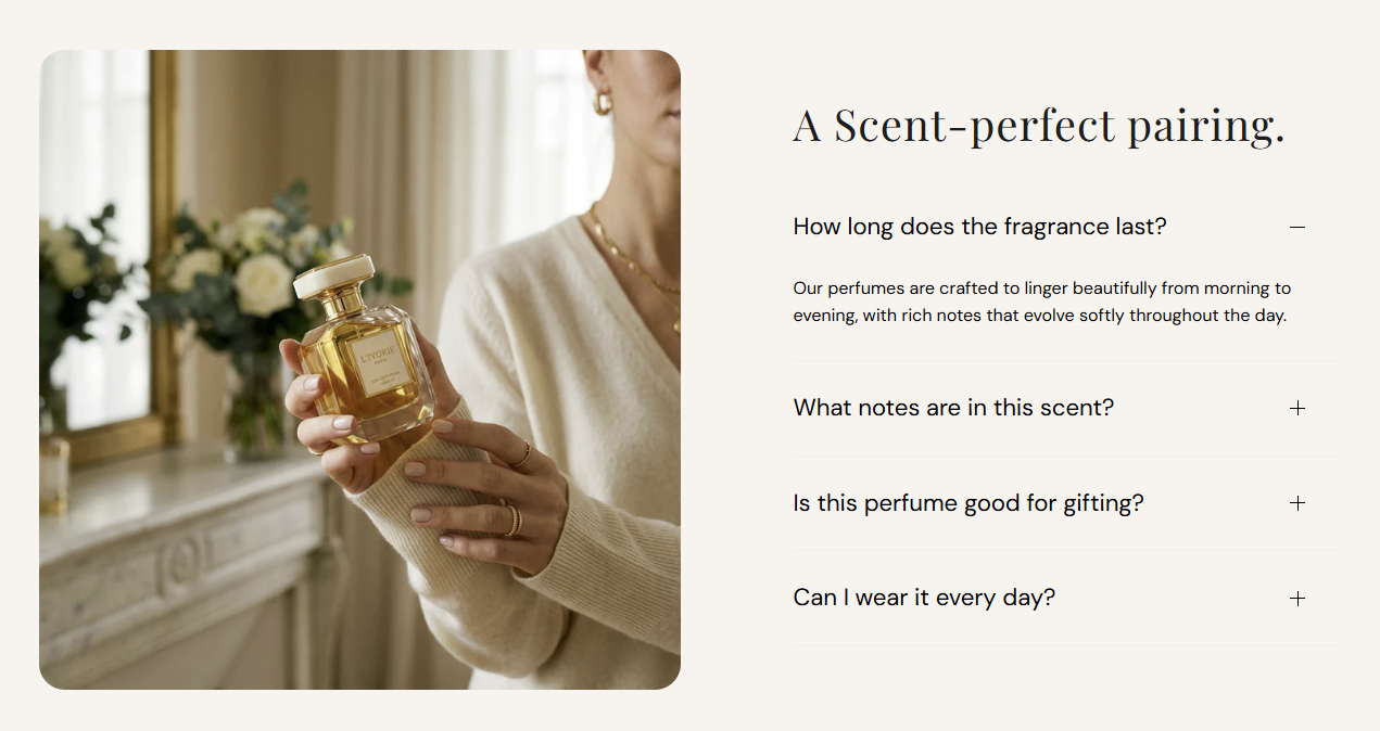
Section title beside the accordion (for example A Scent-perfect pairing.). Leave blank to hide the heading.
Usage
- Use a short headline that introduces the accordion topics.
- Keep it to one line for a clean split layout.
Collapsible image content pairs a large product or lifestyle image with an accordion list beside it. Add up to eight collapsible items, each with a question-style heading and rich-text answer, plus section-level colors for the background, heading, and accordion rows.
Storefront preview
Themes → Customize → Add section → Collapsible image content
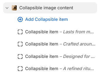
Find it under Images and media in the section picker. After adding the section, use Add Collapsible item for each accordion row (up to 8).
Theme editor section list
Section title beside the accordion (for example A Scent-perfect pairing.). Leave blank to hide the heading.
Usage
Color of the section heading. Default color: #1D1D1D.
Usage
Photo shown in the left column on desktop (stacks above the accordion on mobile). Recommended size: 750 px wide; use 1500 px for retina quality.
Usage
Describes the image for accessibility and SEO. Falls back to the image file alt text or section heading when left blank.
Usage
Sets the crop shape of the section image. Default: Auto – Original.
Usage
Rounds the image corners using presets from Theme settings → Border radius. Default: Extra large radius.
Usage
Fill color behind the image and accordion area. Default color: #FFFFFF.
Usage
Color of each accordion row heading. Default color: #000000.
Usage
Color of the divider lines between accordion rows. Default color: #EDEDED.
Usage
Question or label shown on the accordion row (for example Lasts from morning to midnight.). Required for the row to appear on the storefront.
Usage
Rich-text answer revealed when the row is expanded. Supports bold, italic, links, and lists.
Usage
Expands this accordion row when the page first loads. Default: Off.
Usage
Adds empty space above and below this section on desktop and mobile.
Usage