Heading
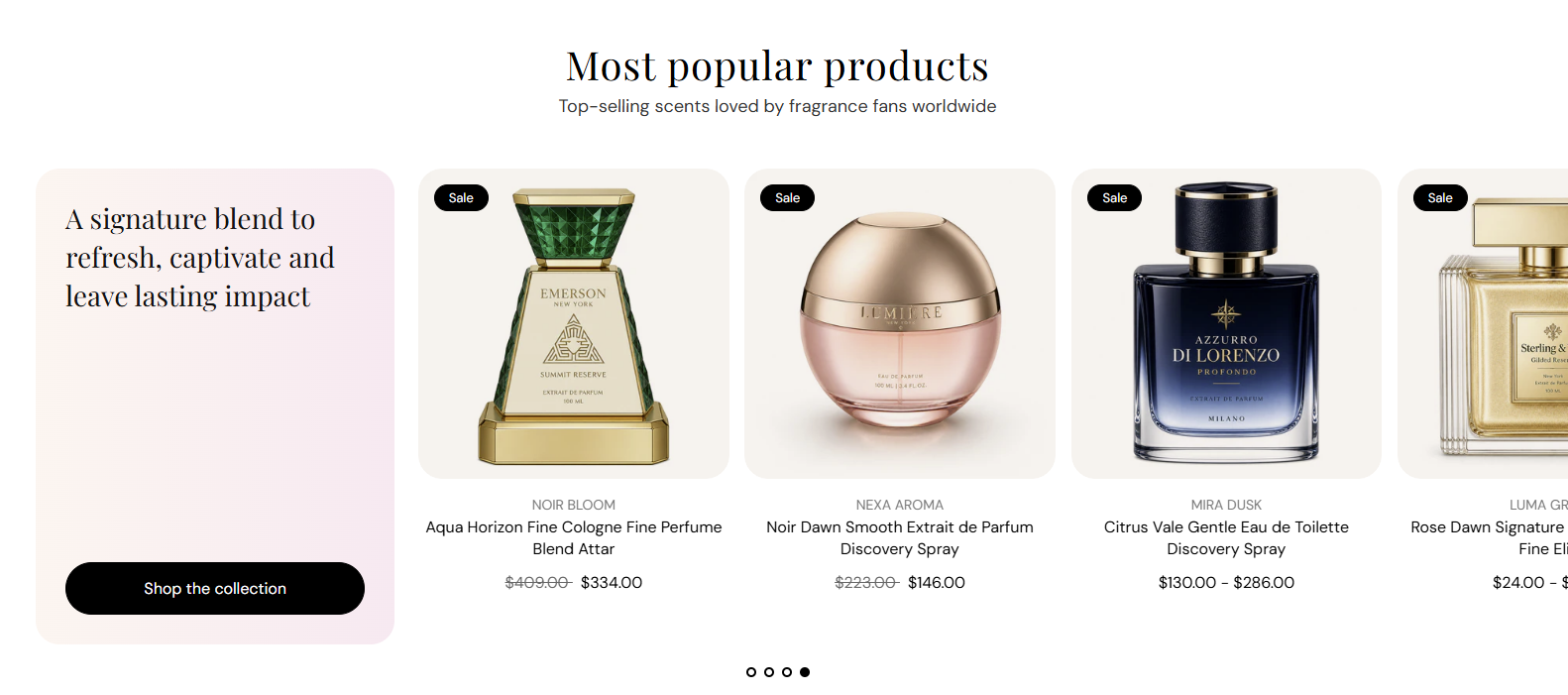
Main title centered above the editorial panel and product slideshow. Default: Most popular products. Leave blank to hide the heading.
Usage
- Use a short headline that introduces the product row.
- Keep to one line for a clean centered layout.
Editorial product feature pairs a styled editorial panel with a product slideshow from a collection you choose. Use it to spotlight bestsellers beside campaign copy, a shop button, and a warm solid or gradient background.
Storefront preview
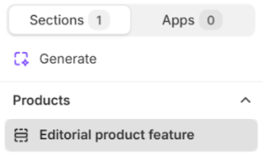
Themes → Customize → Add section → Editorial product feature
Find it under Products in the section picker. Pick a collection and adjust the editorial panel and product slideshow from the section settings.
Theme editor section list
Main title centered above the editorial panel and product slideshow. Default: Most popular products. Leave blank to hide the heading.
Usage
Supporting line under the heading. Default: Top-selling scents loved by fragrance fans worldwide. Leave blank to show the heading only.
Usage
Choose which collection supplies the products shown in the slideshow.
Usage
Maximum number of products pulled from the selected collection. Range: 1–25. Default: 8.
Usage
How many product cards appear per row on large screens. Options: 2, 3, 4, or 5 columns. Default: 4.
Usage
How many product cards appear per row on tablet screens. Options: 2, 3, or 4 columns. Default: 3.
Usage
How many product cards appear per row on phones. Options: 1 or 2 columns. Default: 2.
Usage
Shows dot indicators below the product slideshow when there is more than one slide. Default: On.
Usage
Automatically advances the product slideshow after the time set in Autoplay speed. Default: On.
Usage
Time each slide stays visible before autoplay moves to the next. Range: 2–10 s (step 2). Default: 6 s.
Usage
Color of the pagination dots below the slideshow. Default color: #000000.
Usage
Main title inside the editorial panel beside the product slideshow. Leave blank to hide the heading.
Usage
Text on the call-to-action button in the editorial panel. Default: Shop the collection. Leave blank to hide the button.
Usage
Destination when the editorial button is clicked—a collection, product, or page in your store.
Usage
Visual style for the editorial button. Options: Primary, Secondary, Tertiary, or Arrow button. Default: Tertiary.
Usage
Opens the button link in a new browser tab when enabled. Default: Off.
Usage
Color of the editorial panel heading. Default color: #121212.
Usage
Base text color for content in the editorial panel. Default color: #121212.
Usage
Fill style behind the editorial panel. Options: Solid or Gradient. Default: Gradient.
Usage
Flat fill color for the editorial panel when Background style is Solid. Default color: #FFF5F0.
Usage
Color blend for the editorial panel when Background style is Gradient. Default: warm pink-to-cream gradient (#FFF5F0 to #FCE9F1).
Usage
Adds empty space above and below this section on desktop and mobile.
Usage