Heading
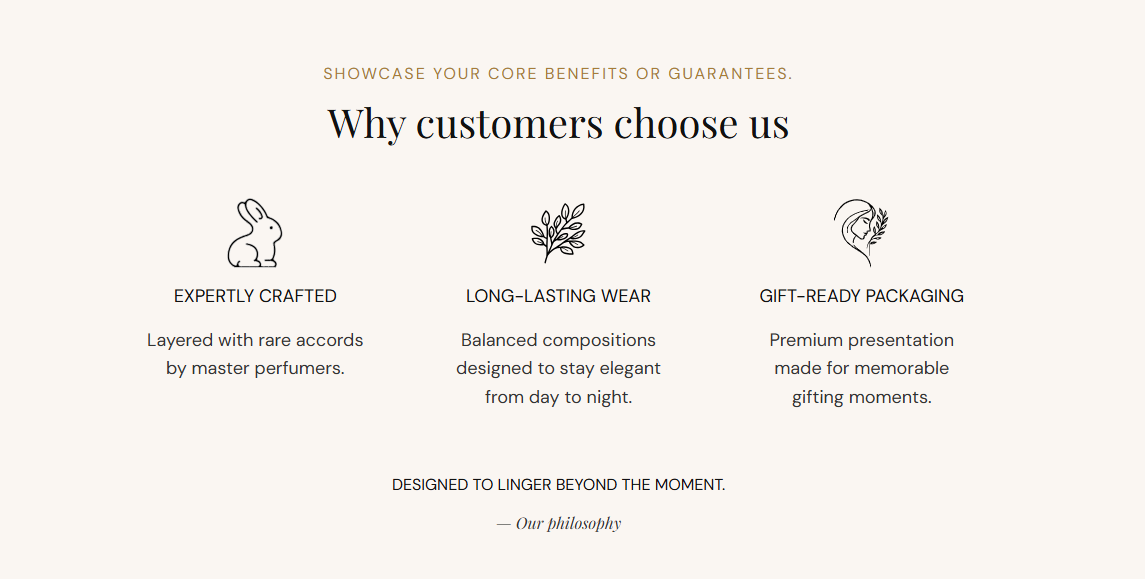
Main title shown above the benefit row. Default: Why customers choose us.
Usage
- Keep it short and trust-focused (for example quality, service, or expertise).
- Leave blank to hide the heading and show only benefit items.
Product benefits is a styled trust row with a heading, icon-led benefit blocks, and an optional footer tagline. Use it to showcase guarantees, craftsmanship, or service promises with customizable colors and a solid, gradient, or image background.
Storefront preview
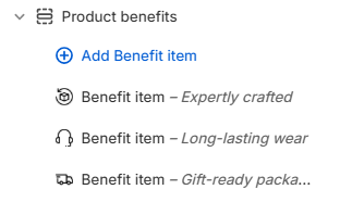
Themes → Customize → Add section → Product benefits
Find it under the Trust and reviews group in the section picker. After adding the section, use Add Benefit item to add one block per benefit.
Theme editor section list
Main title shown above the benefit row. Default: Why customers choose us.
Usage
Sets the color of the section heading. Default: #111111.
Usage
Supporting line below the heading. Default: Showcase your core benefits or guarantees.
Usage
Sets the color of the subheading text. Default: #B9782D.
Usage
Closing line shown below the benefit row (for example Designed to linger beyond the moment.). Default: Designed to linger beyond the moment.
Usage
Sets the color of the tagline text. Default: #111111.
Usage
Sign-off or attribution beside the tagline (for example — Our philosophy). Default: — Our philosophy
Usage
Sets the color of the author line. Default: #333333.
Usage
Sets the text color for each benefit item heading and description. Default: #333333.
Usage
Chooses how the section background is filled. Default: Solid.
Usage
Fill color when Background type is Solid. Default color: #F8F7F3.
Usage
Color blend when Background type is Gradient. Choose a gradient preset in the picker. Default: warm pink-to-cream gradient (#FFF5F0 to #FCE9F1).
Usage
Full-width background photo when Background type is Image. Recommended size: 2000 px wide; upload 4000 px for retina quality.
Usage
Image shown above each benefit title. Recommended size: 70 px; upload 140 px for sharp display on retina screens.
Usage
Describes the icon for screen readers when the image adds meaning beyond decoration.
Usage
Title for this benefit (for example Expertly crafted). Shown below the icon.
Usage
Supporting line under the benefit heading (for example Layered with rare accords by master perfumers.).
Usage
Adds empty space above and below this section on desktop and mobile.
Usage