Theme Sections

Product showcase

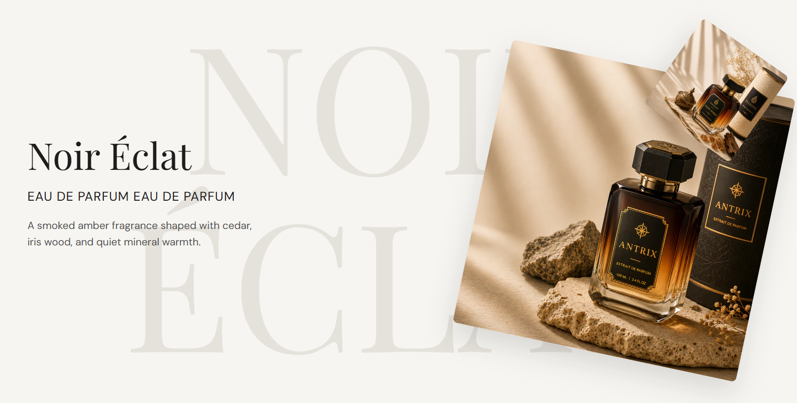
Product showcase highlights a fragrance or hero product with a heading, tagline, and description on the left and a layered primary and secondary image stack on the right. Large decorative text sits behind the layout for editorial impact.

Storefront preview

Product showcase section on the Fragrance Shop storefront

Storefront preview

Where to find this section

Product showcase listed under Images and media in the Shopify section picker

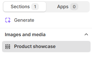
Theme editor section picker

Appearance

Background

Section background color behind the text, images, and decorative text. Default: #F6F5F1.

Usage

  • Choose a soft neutral that lets product photography stand out.
  • Match your page background or alternate sections for visual rhythm.

Decorative text

Decorative text

Large text shown behind the section content. Press Enter to break lines. Scales with viewport width. Default: NOIR on the first line and ÉCLAT on the second.

Usage

  • Use short words or initials for a subtle watermark effect.
  • Press Enter to stack text on multiple lines behind the layout.
  • Leave blank to hide the decorative background text.

Text color

Color for the decorative background text. Default: #E5E2DC.

Usage

  • Keep the color lighter than the section background so it reads as a watermark.
  • Preview on desktop and mobile—the text scales with screen width.

Text size

Sets decorative text size using viewport width units. Default: 22 vw · Range: 20–40 vw.

Usage

  • Increase for bolder background typography on large screens.
  • Decrease if the decorative text overlaps heading or image areas on smaller viewports.

Content

Heading

Main product or collection title in the left column. Default: Noir Éclat.

Usage

  • Use your product or fragrance line name.
  • Leave blank to hide the heading on the storefront.

Heading color

Text color for the heading. Default: #1D1D1D.

Usage

  • Ensure strong contrast against the section background.

Tagline

Short line below the heading—often product type or concentration. Default: EAU DE PARFUM EAU DE PARFUM.

Usage

  • Keep it brief and in uppercase for a luxury label feel.
  • Leave blank to hide the tagline.

Tagline color

Text color for the tagline. Default: #1D1D1D.

Usage

  • Match or complement the heading color for a cohesive look.

Description

Supporting copy beneath the tagline. Supports line breaks. Default: A smoked amber fragrance shaped with cedar, iris wood, and quiet mineral warmth.

Usage

  • Describe notes, mood, or key benefits in one or two sentences.
  • Leave blank to show heading and tagline only.

Description color

Text color for the description. Default: #4F4F4F.

Usage

  • Use a softer shade than the heading for comfortable reading.

Primary image

Image

Main product photo in the layered image stack. Recommended display width: 500 px. Upload a 2× image at 1000 px for retina screens.

Usage

  • Use a high-quality hero shot with consistent lighting.
  • The primary image appears larger and slightly rotated behind the secondary image.

Image alt text

Describes the primary image for accessibility. Falls back to the image alt text or heading when empty.

Usage

  • Describe the product shown if the image conveys information.
  • Leave blank to use the media library alt text or heading as a fallback.

Image corner radius

Rounds the primary image corners using presets from Theme settings → Border radius. Default: Medium radius.

Usage

  • Pick a preset that matches rounded corners used elsewhere on your store.
  • Adjust independently from the secondary image if needed.

Secondary image

Image

Smaller overlapping product photo. Recommended display width: 180 px. Upload a 2× image at 360 px for retina screens.

Usage

  • Show packaging, an alternate angle, or a detail crop.
  • Pairs with the primary image for a layered editorial layout.

Image alt text

Describes the secondary image for accessibility. Falls back to the image alt text or heading when empty.

Usage

  • Describe what appears in the smaller image if it adds context.
  • Leave blank to use the media library alt text or heading as a fallback.

Image corner radius

Rounds the secondary image corners using presets from Theme settings → Border radius. Default: Medium radius.

Usage

  • Match the primary image radius for a consistent stacked look.

Section spacing

Section spacing

Adds empty space above and below this section on desktop and mobile.

Usage

  • Top padding (desktop) — Default: 40 px · 0–100 px
  • Bottom padding (desktop) — Default: 40 px · 0–100 px
  • Top padding (mobile) — Default: 40 px · 0–100 px
  • Bottom padding (mobile) — Default: 40 px · 0–100 px
  • When you move the slider, the gap above or below grows or shrinks