Heading
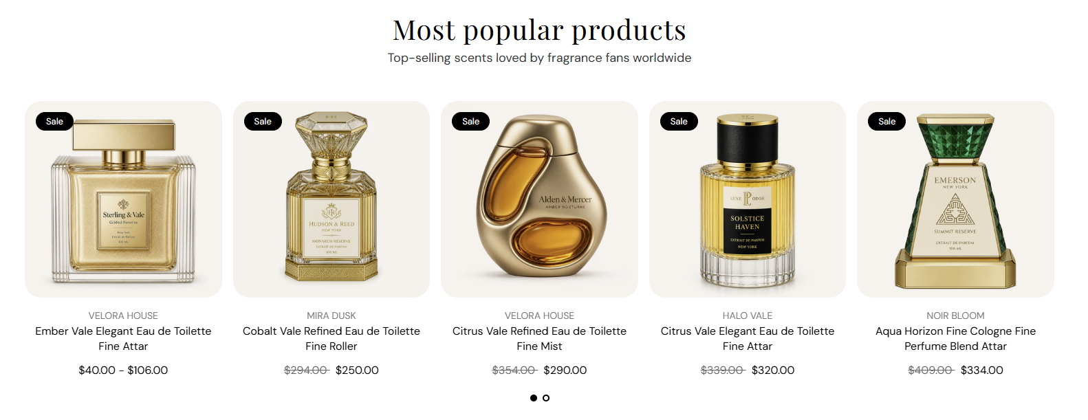
Main title centered above the product row. Default: Most popular products. Leave blank to hide the heading.
Usage
- Use a short headline that introduces the collection products.
- Keep to one line for a clean centered layout.
Featured collection shows products from a collection you choose, with a centered heading and subheading above the row. Display them in a static product grid or a slideshow, and control how many cards appear per row on desktop, tablet, and mobile.
Storefront preview
Themes → Customize → Add section → Featured collection
Find it under Products in the section picker. Pick a collection, choose list or slideshow layout, and set how many products to show.
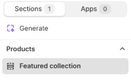
Theme editor section list
Main title centered above the product row. Default: Most popular products. Leave blank to hide the heading.
Usage
Supporting line under the heading. Default: Top-selling scents loved by fragrance fans worldwide. Leave blank to show the heading only.
Usage
Choose which collection supplies the products shown in this section.
Usage
How products are displayed. Options: Product list or Product slideshow. Default: Product list.
Usage
Maximum number of products pulled from the selected collection. Range: 1–25. Default: 8.
Usage
How many product cards appear per row on large screens. Options: 2, 3, 4, or 5 columns. Default: 4.
Usage
How many product cards appear per row on tablet screens. Options: 2, 3, or 4 columns. Default: 3.
Usage
How many product cards appear per row on phones. Options: 1 or 2 columns. Default: 2.
Usage
Shows dot indicators below the product slideshow when there is more than one slide. Applies when Layout is Product slideshow. Default: On.
Usage
Automatically advances the product slideshow after the time set in Autoplay speed. Applies when Layout is Product slideshow. Default: Off.
Usage
Time each slide stays visible before autoplay moves to the next. Range: 2–10 s (step 2). Default: 6 s. Applies when Layout is Product slideshow.
Usage
Color of the pagination dots below the slideshow. Default color: #000000. Applies when Layout is Product slideshow.
Usage
Adds empty space above and below this section on desktop and mobile.
Usage