Theme Sections

Hand-picked products

Hand-picked products shows a curated row or slideshow of fragrances you choose manually. Add a section heading, pick up to sixteen products with individual blocks, and choose between a static product list or a slideshow with optional autoplay.

Storefront preview

Hand-picked products section preview on the Fragrance Shop storefront

Storefront preview

Where to find this section

Hand-picked products section and Product blocks in the Fragrance Shop theme editor

Theme editor section structure

Content

Section heading

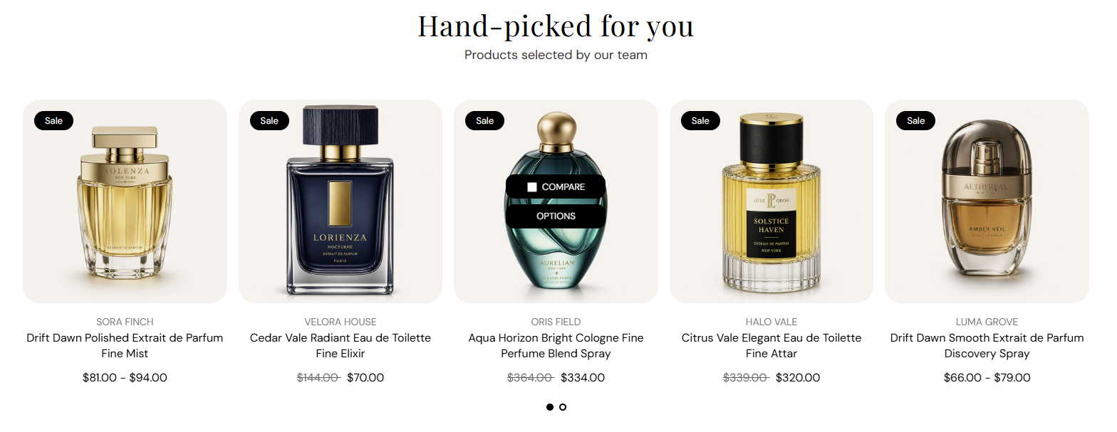
Main title above the product row (for example Hand-picked for you). Default: Hand-picked for you. Leave blank to hide the heading.

Usage

  • Use a short headline that introduces your curated selection.
  • Keep to one line for a clean centered layout.

Section subheading

Supporting line under the heading (for example Products selected by our team). Default: Products selected by our team. Leave blank to show the heading only.

Usage

  • Add one sentence that explains why these products are featured.
  • Leave blank for a heading-only section.

Products

Display layout

Choose how products appear on the storefront: Product list shows a grid of cards; Product slideshow shows one row with swipe or arrow navigation. Default: Product list.

Usage

  • Pick Product list when you want all picked products visible at once.
  • Pick Product slideshow when you have many products or want a carousel on smaller screens.
  • Slideshow controls appear in the editor when Product slideshow is selected.

Product grid

Columns on desktop

Number of product cards per row on large screens. Options: 2–5. Default: 4.

Usage

  • Use 4 or 5 for a full-width product row on desktop.
  • Applies to both Product list and Product slideshow layouts.

Columns on tablet

Number of product cards per row on tablet screens. Options: 2–4. Default: 3.

Usage

  • 3 balances readability and product count on medium screens.
  • Lower the count if product titles wrap to multiple lines.

Columns on mobile

Number of product cards per row on phones. Options: 1–2. Default: 2.

Usage

  • Use 2 to show a compact pair of cards side by side.
  • Use 1 for larger product images on small screens.

Slideshow

Show pagination dots

Shows dot indicators below the slideshow so customers can jump between slides. Default: On.

Usage

  • Keep on when the slideshow has more products than fit in one view.
  • Turn off for a minimal look when arrows alone are enough.

Enable autoplay

Automatically advances slides after the time set in Autoplay speed. Default: Off.

Usage

  • Turn on to rotate products without customer interaction.
  • Leave off so customers control pacing—recommended for product browsing.

Autoplay speed

Seconds each slide stays visible before advancing when autoplay is on. Range: 2–10 s, step 2. Default: 6 s.

Usage

  • Use 6–8 s so customers have time to read product names.
  • Only applies when Enable autoplay is turned on.

Dot color

Color of the pagination dots below the slideshow. Default color: #000000.

Usage

  • Pick a color with enough contrast against the section background.
  • Applies only when Show pagination dots is on.

Product block

Product

Choose the product shown in this block. Search by name or browse your catalog in the theme editor product picker.

Usage

  • Click Add Product under the section to add another block (up to 16).
  • Drag blocks in the left panel to change the order on the storefront.
  • Each block shows one product card using your global Product cards theme settings.

Section spacing

Section spacing

Adds empty space above and below this section on desktop and mobile.

Usage

  • Top padding (desktop) — Default: 40 px · 0–100 px
  • Bottom padding (desktop) — Default: 40 px · 0–100 px
  • Top padding (mobile) — Default: 40 px · 0–100 px
  • Bottom padding (mobile) — Default: 40 px · 0–100 px
  • When you move the slider, the gap above or below grows or shrinks