Theme Sections

Rich text

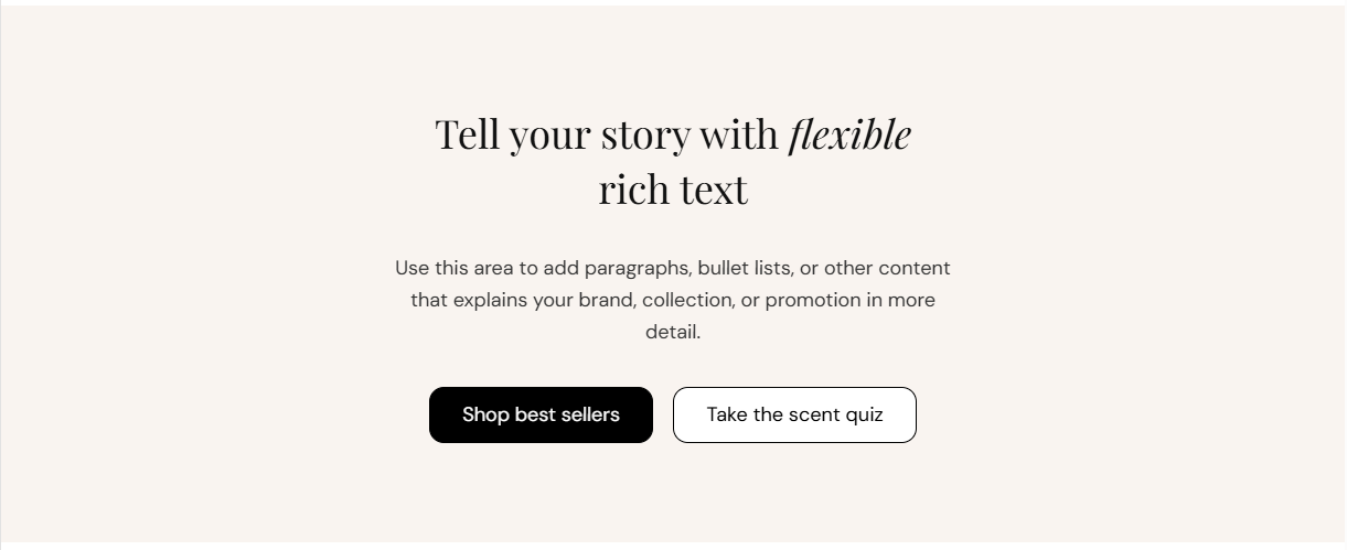
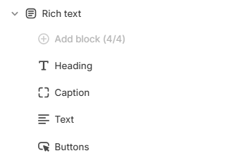
Rich text is a flexible content block for headings, captions, body copy, and up to two buttons. Stack Heading, Caption, Text, and Buttons blocks in any order and align the content left, center, or right.

Storefront preview

Rich text section preview on the Fragrance Shop storefront

Storefront preview

Where to find this section

Rich text section and content blocks in the Fragrance Shop theme editor

Theme editor section list

Layout

Text alignment

Aligns all content in the section—heading, caption, body text, and buttons. Options: Left, Center, or Right. Default: Center.

Usage

  • Use Center for hero-style brand stories and promotional copy.
  • Use Left or Right when this section sits beside imagery or in asymmetric layouts.
  • Button rows follow the same alignment as the text above them.

Background color

Solid fill behind the entire section, shown beneath your content and any background image. Default color: #F9F4F0.

Usage

  • Use a soft neutral to separate this block from surrounding sections.

Heading block

Heading

Main headline for the section. Default: Tell your story with flexible rich text.

Usage

  • Add one Heading block maximum per section.
  • Keep it short so it reads clearly at large sizes.

Heading tag

HTML heading level (H1 through H6) used for SEO and page structure. Default: H2.

Usage

  • Use H2 for section titles on most pages.
  • Use H1 only when this is the primary headline on the page.

Heading color

Text color for the heading. Default color: #111111.

Usage

  • Match your theme’s primary text color for consistency.
  • Use a brand accent only when contrast against the page background remains strong.

Caption block

Caption

Short supporting line shown in a secondary font, typically above or below the heading depending on block order. Default: A short piece of supporting text that appears above or below the headline.

Usage

  • Add one Caption block maximum per section.
  • Use for a category label, date, or one-line teaser.
  • Leave blank to hide the caption.

Caption color

Text color for the caption. Default color: #666666.

Usage

  • Use a softer tone so the caption sits below the heading without competing.

Text block

Text

Rich text body copy for paragraphs, lists, and links. Default: placeholder paragraph about brand or collection storytelling.

Usage

  • Add one Text block maximum per section.
  • Use for longer explanations, bullet lists, or formatted copy.

Text color

Color for body text. Default color: #333333.

Usage

  • Keep body text slightly softer than the heading for readable hierarchy.

Buttons block

Primary button

First call-to-action link. Set a Label, Link, Open link in new tab, and Style (Primary, Secondary, Tertiary, or Tertiary with arrow). Default label: Shop best sellers. Default style: Primary.

Usage

  • Use for the main action you want customers to take.
  • Leave the label blank to hide the primary button.

Secondary button

Optional second link beside the primary button. Same settings as the primary button. Default label: Take the scent quiz. Default style: Secondary.

Usage

  • Use for a lower-priority action such as a quiz, guide, or collection link.
  • Leave the label blank to show only the primary button.

Section spacing

Section spacing

Adds empty space above and below this section on desktop and mobile.

Usage

  • Top padding (desktop) — Default: 40 px · 0–100 px
  • Bottom padding (desktop) — Default: 40 px · 0–100 px
  • Top padding (mobile) — Default: 40 px · 0–100 px
  • Bottom padding (mobile) — Default: 40 px · 0–100 px
  • When you move the slider, the gap above or below grows or shrinks